Case study: Enhancing Donorbox Form Editor with Live Preview
Role
Senior UX/UI Product Designer and Manager
Duration
January 2022 – May 2022
Goal Overview
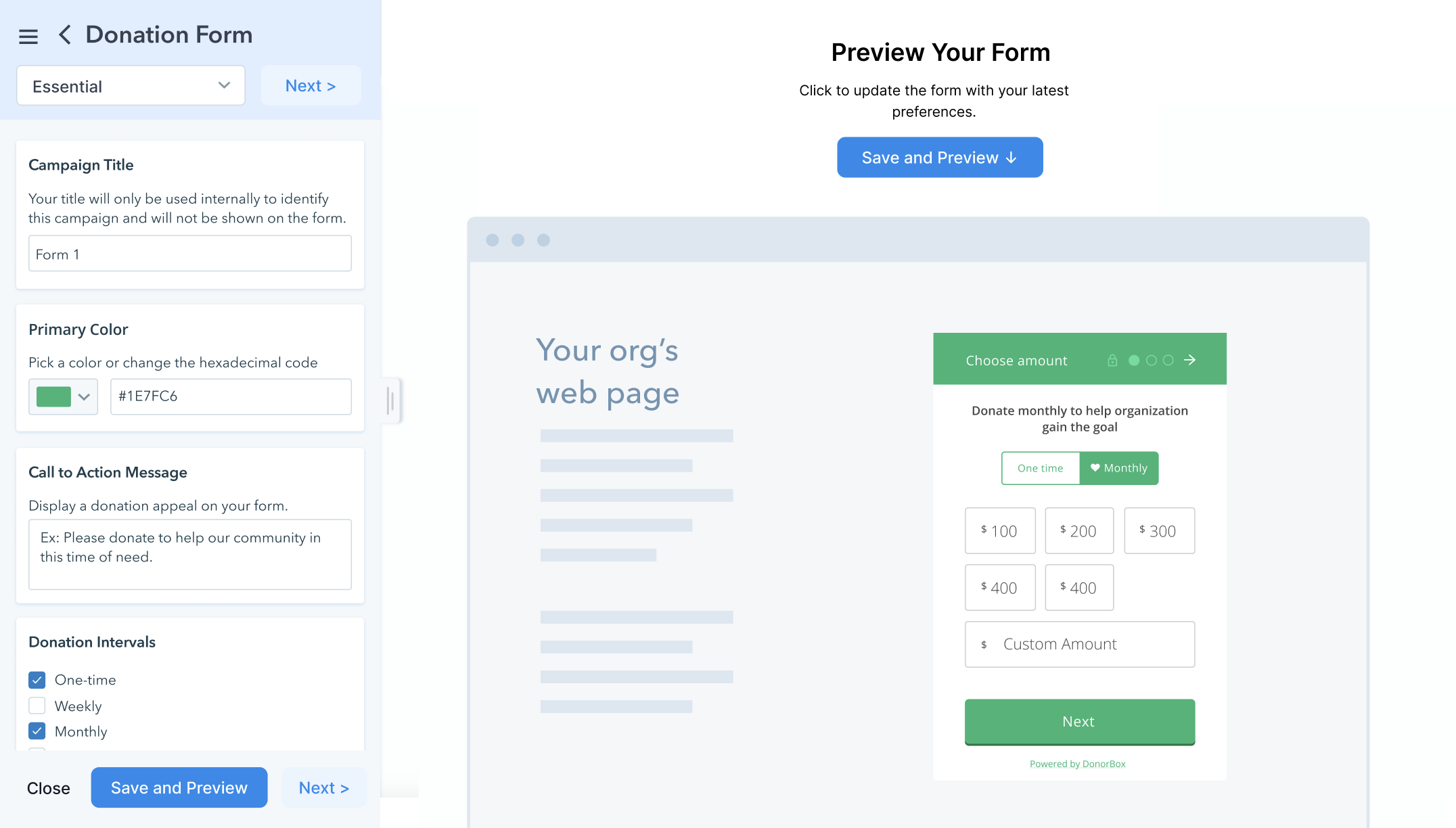
- The primary goal of this project was to add a live preview to the existing form editor, which previously only used static images. The lack of real-time previews caused confusion, as users couldn’t see their changes reflected immediately.
- In addition to adding the preview feature, we made minor UI tweaks and improved the information architecture to make the editor more user-friendly and visually clear.
- We also aimed to clarify several options in the left toolbar for better usability.
- The form editor for first-time form creation displayed a simplified version with only basic options, which led to confusion as users believed those were the only available features. Our intention was to show the full dropdown menu right from the start to avoid this issue.
Existing Form Editor Design
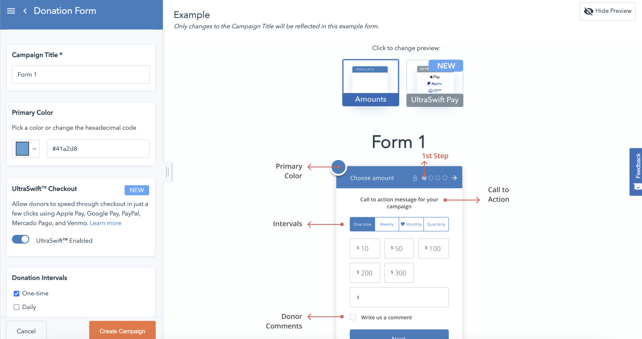
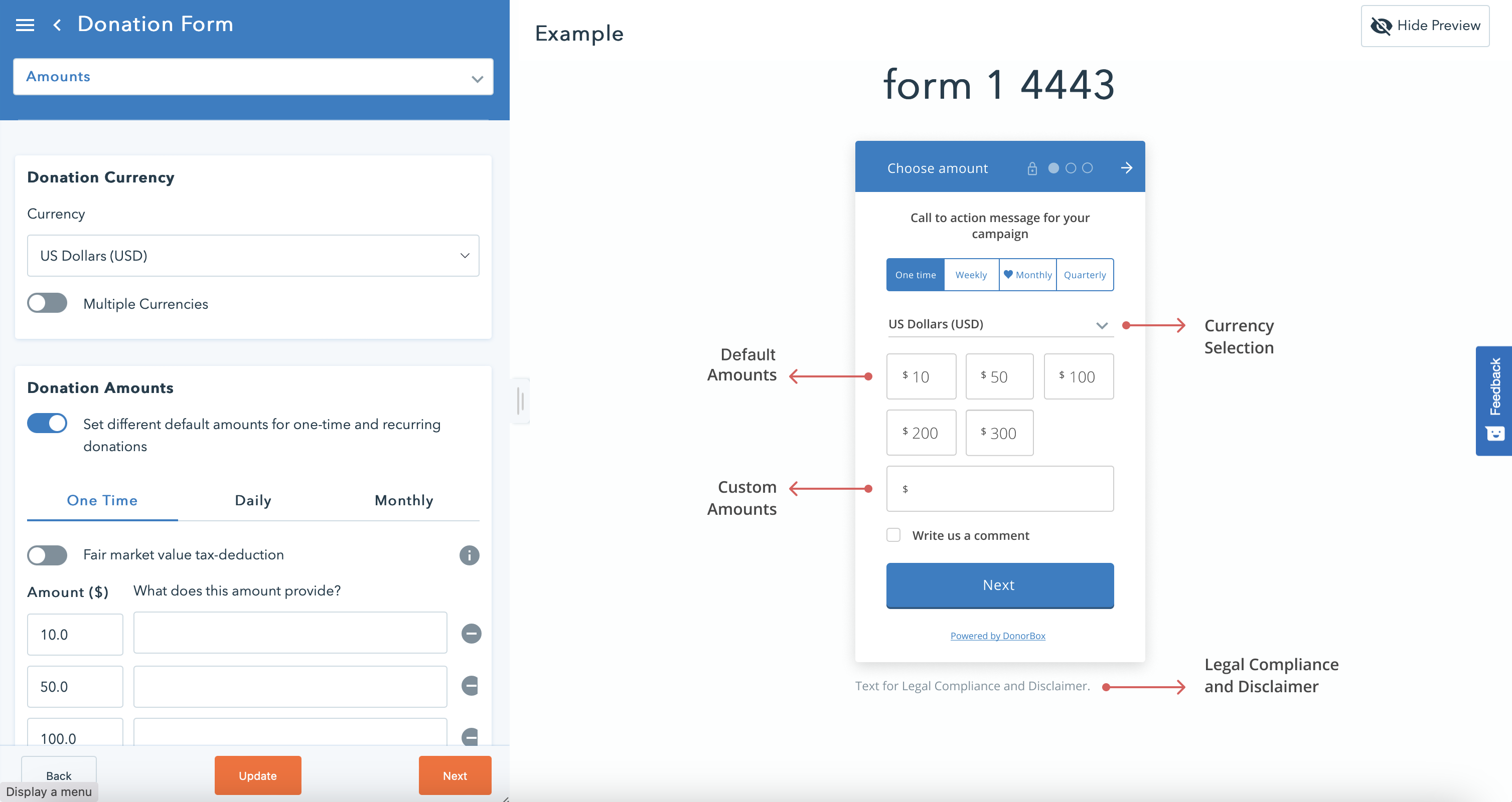
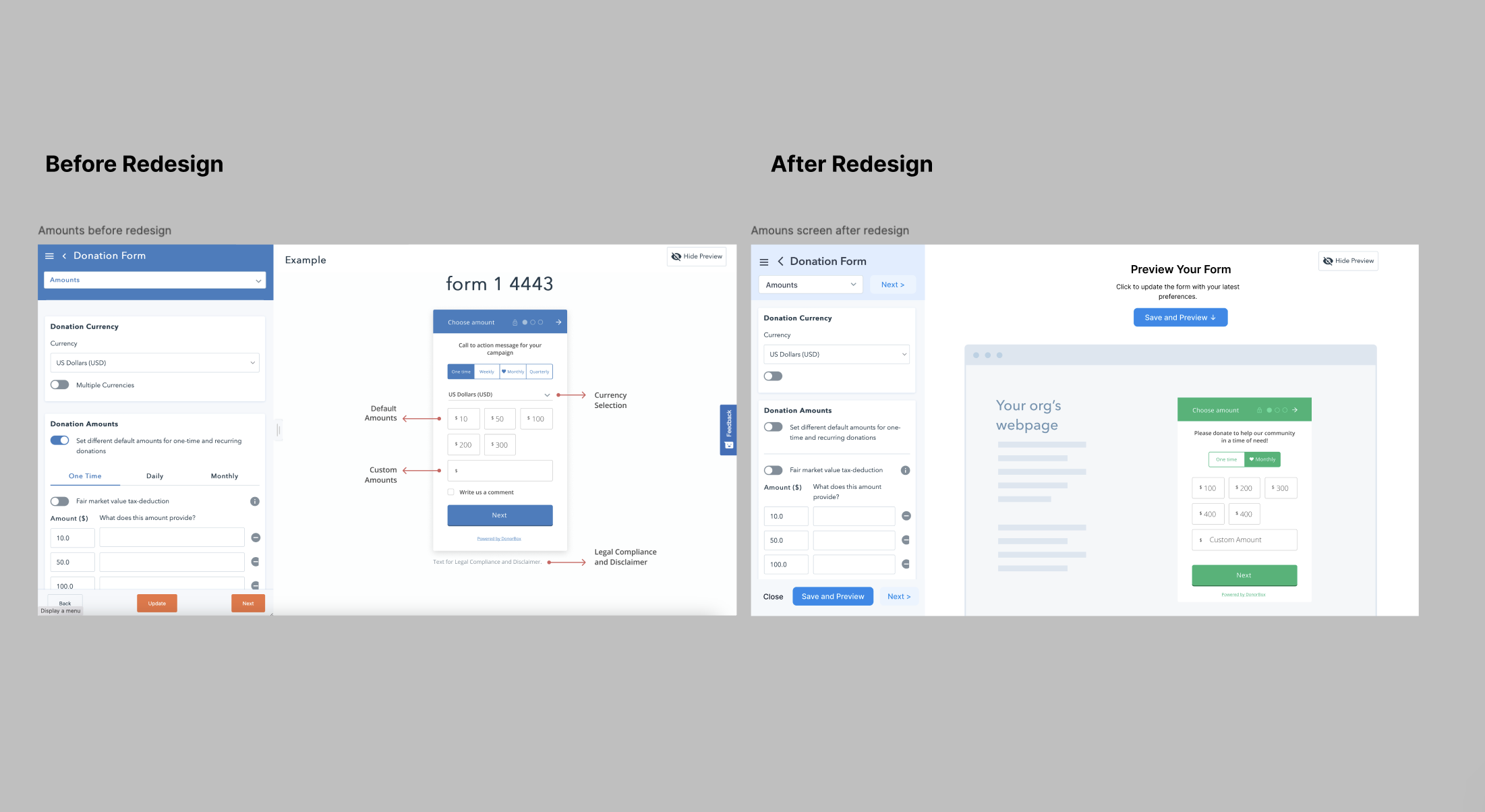
The existing form editor design preview included static images, not real live preview. This caused that some states like color change, and various states did not preview at all - adding to the user confusion how the end for will look like.
The form editor for first-time form creation displayed a simplified version with only basic options, causing confusion among users who believed those were the only available features. Additional options were only visible upon reopening the editor a second time.
Challenge
Environment
The project team was spread across different time zones, making coordination between design, development, QA, and stakeholders essential for success.
Limitations
- Limited development resources led us to focus on incremental changes rather than a full redesign.
- A full overhaul was avoided to accommodate power users, especially older users familiar with the existing interface.
- Changes included adding a live preview and making small UI adjustments without disrupting the user experience for long-term users.
Design Process
1. Research & Discovery
User Feedback & Insights:
Based on user feedback, especially from a power user, the following key issues were identified:
- The form editor lacked a live preview, making it difficult for users to see real-time changes.
- Users requested an additional "receipt" option to generate a custom thank-you message after donations.
- Smaller issues included inconsistent functionality in the editor and confusion about call-to-action labels and form options.
Research Done:
- User Research: Conducted user interviews to understand pain points.
- Hotjar Analysis: Analyzed user behavior using Hotjar recordings, which highlighted user struggles with the form editor.
- Customer Surveys: Gathered quantitative and qualitative feedback through user surveys.
- Competitor Analysis: Evaluated similar donation platforms to benchmark best practices.
- Team Feedback: Collected feedback from internal teams, including customer success and accounts.
2. Wireframes, Interaction Design & Information Architecture
Wireframes:
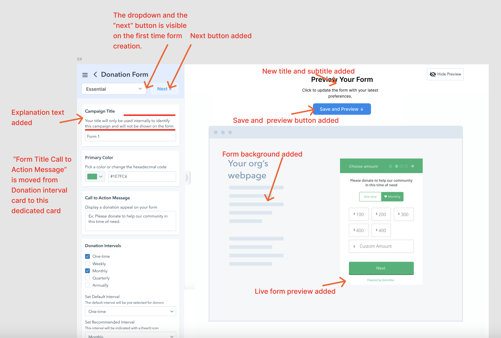
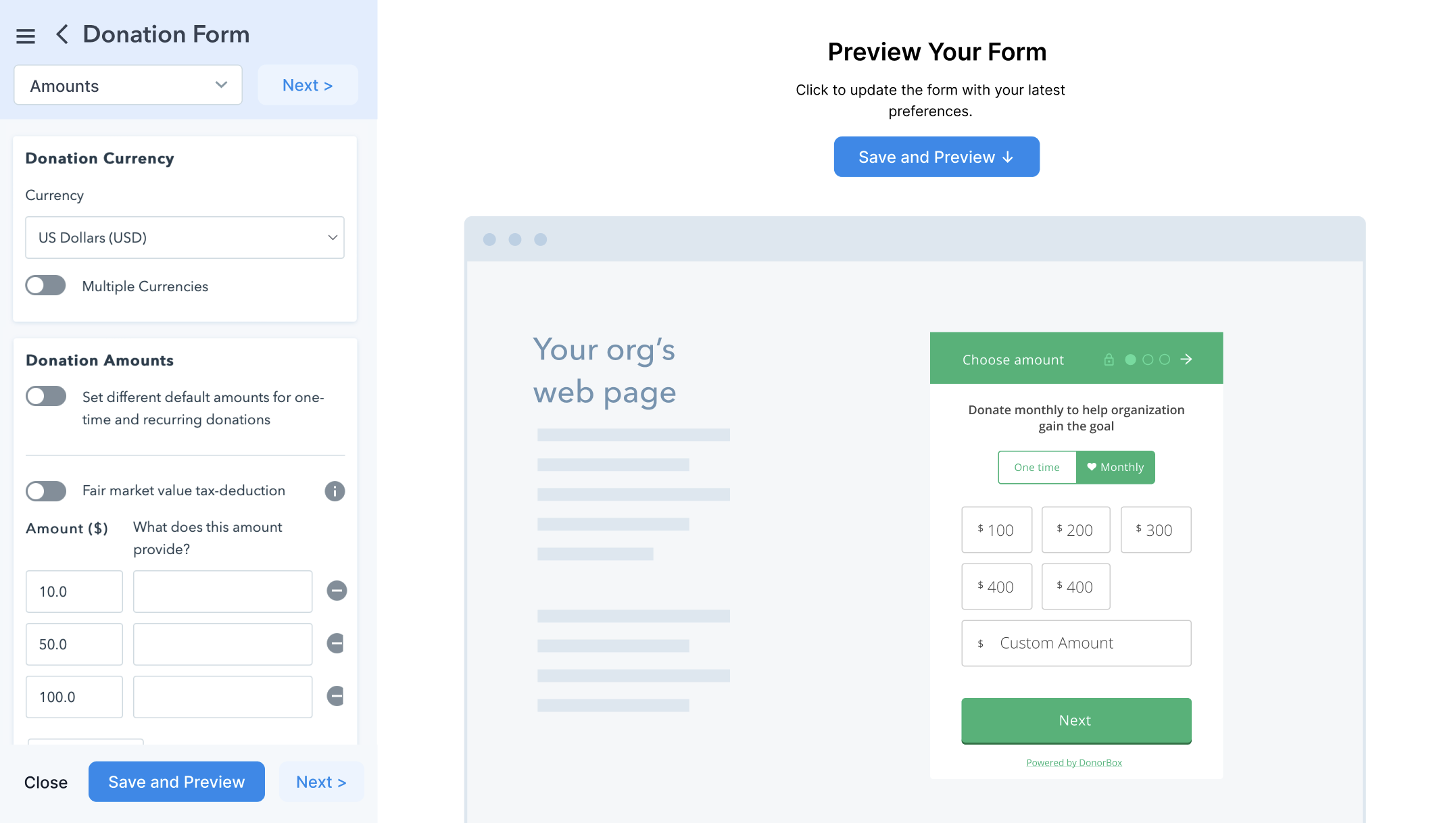
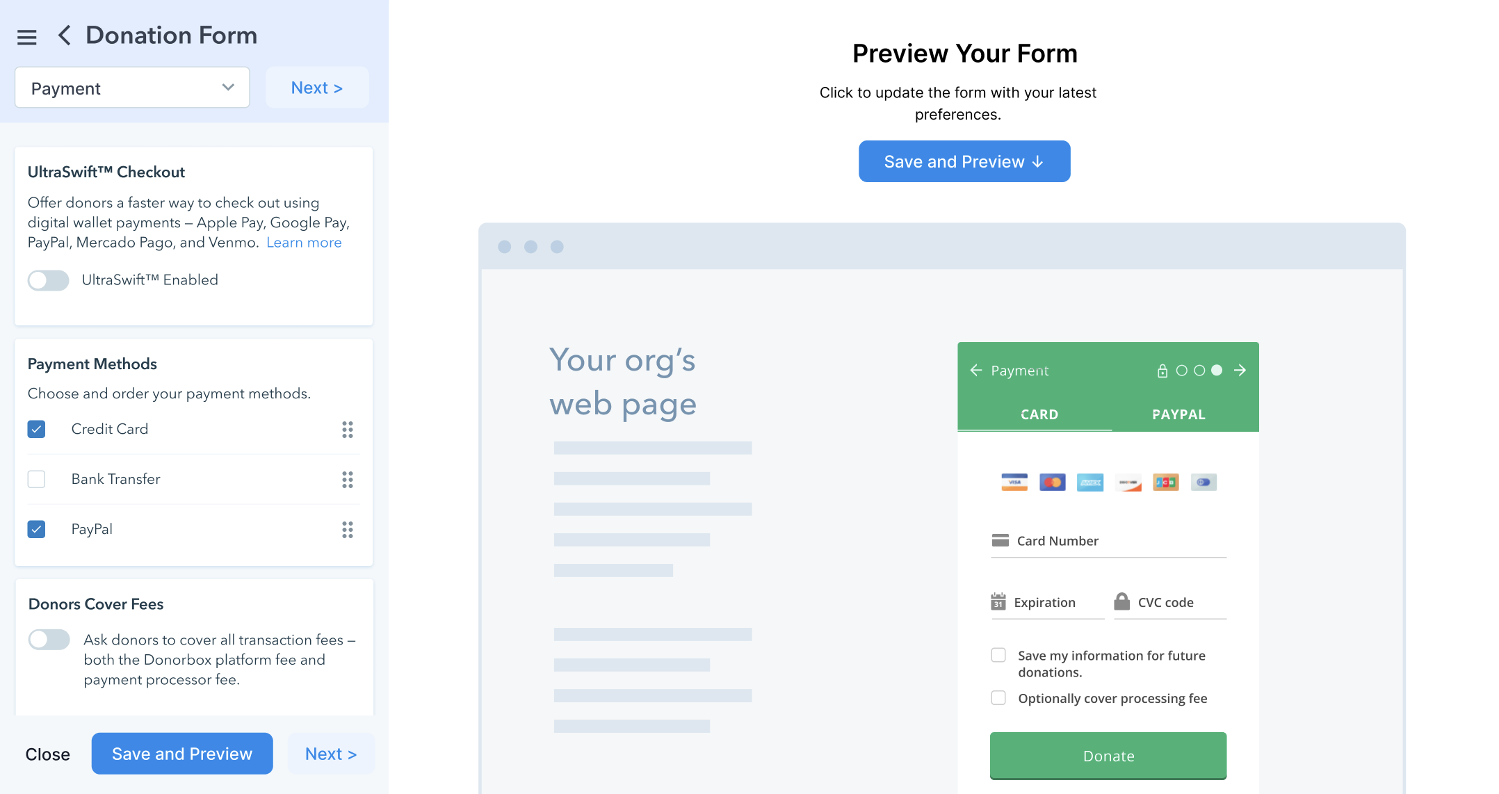
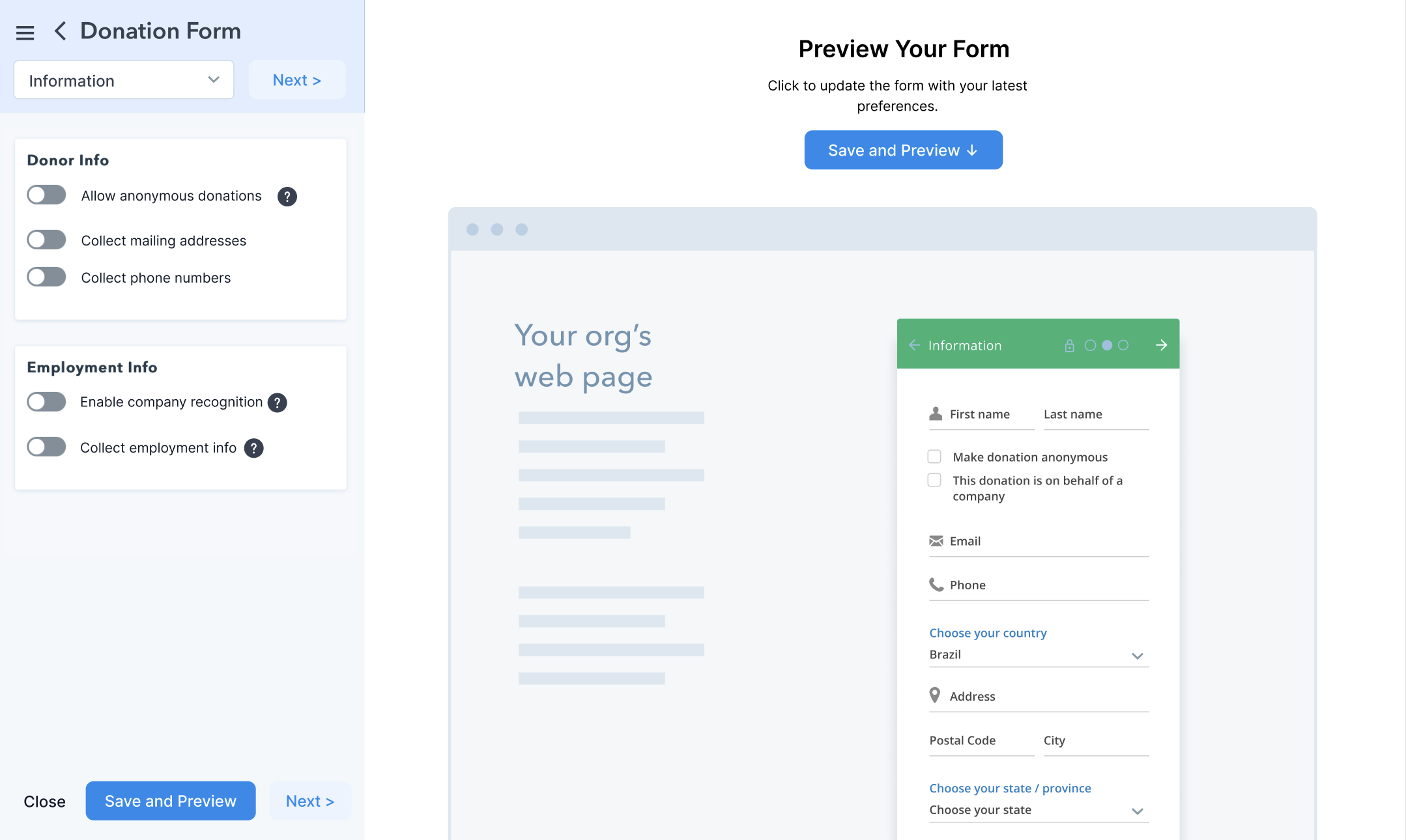
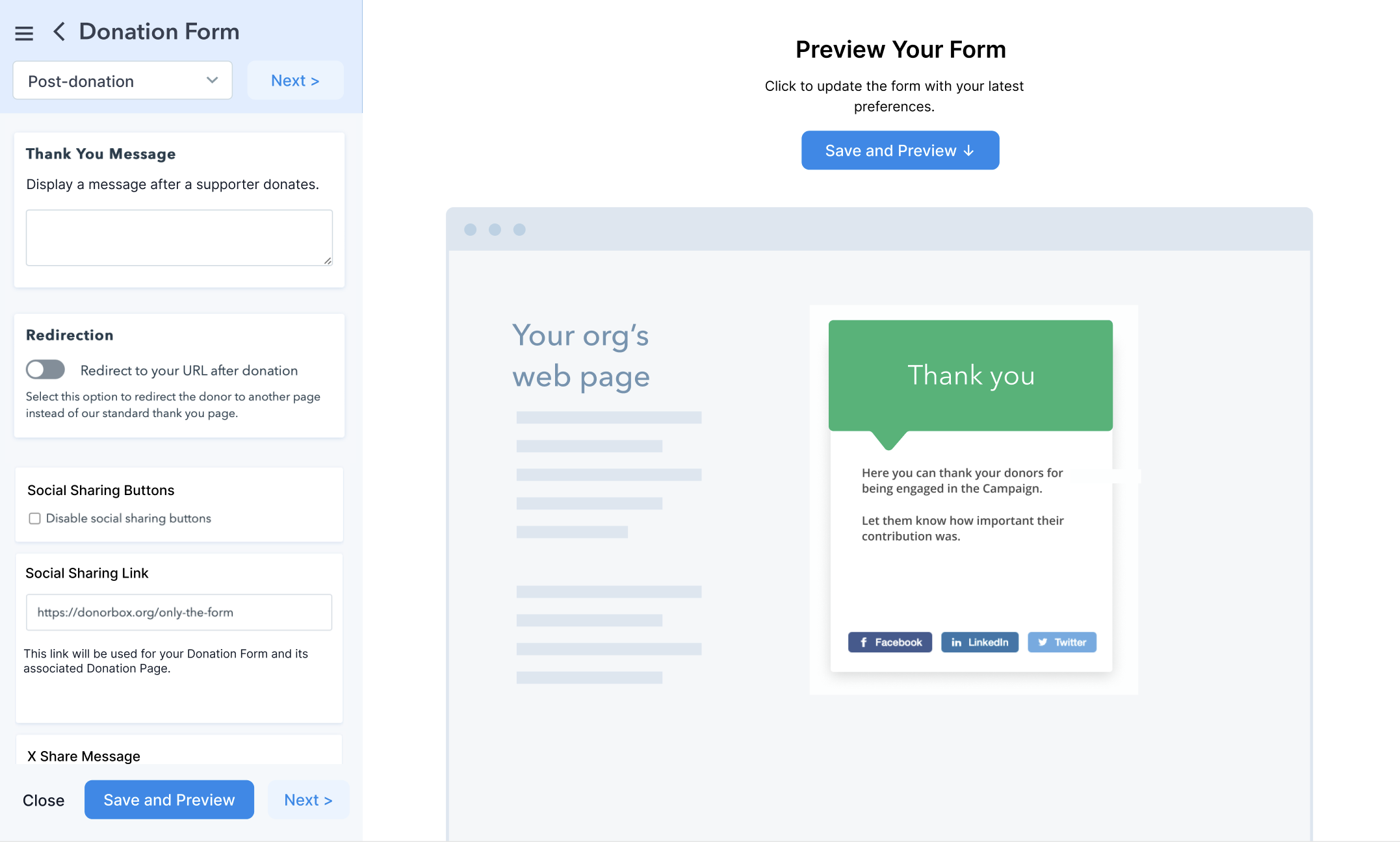
- Developed wireframes to showcase the integration of the live preview and minor UI adjustments, including a refreshed color palette for the editor’s sidebar.
Interaction Design:
- Designed key interactions for real-time updates in the form preview, ensuring that users could see changes immediately as they edited the form.
Information Architecture (IA):
- Refined the form editor’s information architecture by relocating misplaced options and organizing categories more logically.
- Simplified the navigation, making frequently used features more accessible.
Prototyping & Testing:
- Created interactive prototypes using Figma for testing with team members, stakeholders, and selected users.
3. UI Design & Collaboration
UI Design:
- Updated the sidebar with a more neutral background color to improve readability and reduce contrast.
- Simplified the layout for better clarity, focusing on a clean, modern design without overwhelming users.
Coordination with Teams:
- Worked closely with the development team, ensuring the design was implemented according to specifications while balancing technical constraints.
- Collaborated with product management to ensure the design met business objectives without overcomplicating the user experience.
- Engaged with QA teams to identify potential bugs and ensure all edge cases were accounted for during implementation.
- Facilitated communication with stakeholders, keeping them informed of progress and gathering feedback at each stage.

4. User Testing & Iteration
User Testing:
- Conducted internal testing sessions with the product, customer success, and accounts teams to refine the designs.
- Performed live user testing to gather actionable feedback on the redesigned editor.
Iteration:
- Iterated on the prototype based on user feedback, tweaking the UI and interaction flows to make the editor more intuitive.
- Integrated further changes to the information architecture based on testing feedback.
Live Testing & Hotjar Review:
- After the release, we monitored user behavior via Hotjar, confirming that the live preview feature improved user satisfaction and reduced confusion.
Outcome
Impact Metrics
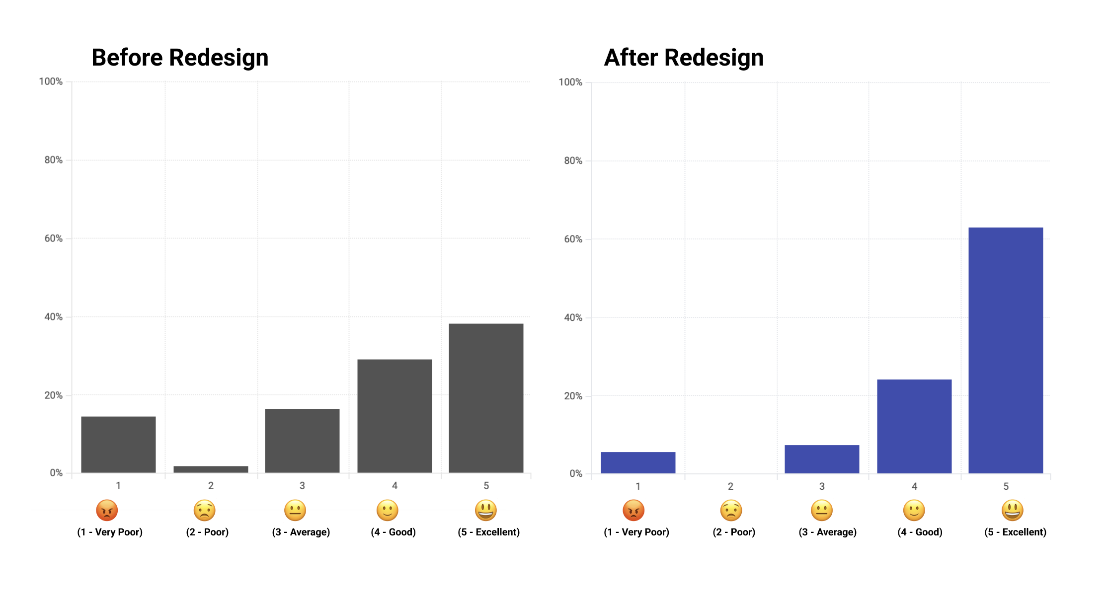
- Customer satisfaction scores improved drastically, measured via post-design Hotjar survey.
- The number of forms created by new users increased by around 10%, indicating better usability and onboarding.
- The live preview feature significantly reduced the confusion users faced when building donation forms, enhancing their overall experience.
What I Learned
The project underscored the importance of focusing on user feedback while balancing technical constraints. Incremental improvements can still yield significant results in both user satisfaction and product adoption, without disrupting existing user behavior.
My contribution:
- project research
- usability testing
- user research
- Information architecture
- UX design
- visual design
- UI design
- Interaction design
- Interaction prototype design
- asset handoff