Case study: Redesign of Donorbox nonprofit donation form (2015)
Role
Senior UX/UI Product Designer
Duration
September 2015 – March 2016, with additional work intermittently in 2017
Overview
Donorbox is a leading non-profit fundraising platform designed to streamline online donations. The goal of this project was to redesign the donation form to improve usability, increase conversion rates, and ensure that it could seamlessly adapt to the branding of different organizations. The redesign focused on simplifying the user experience (UX), enhancing the form's scalability, and aligning it with user expectations, all while complying with the necessary legal requirements for donor information.
Challenge
Environment
Working closely with the Donorbox team, which was a small startup back in 2015, I needed to deliver a form that was not only adaptable to various branding and user flows but also compliant with strict donation laws, which required the collection of extensive personal information. The form needed to maintain its simplicity despite handling complex tasks like supporting multiple donation amounts, recurring donations, and various payment methods.
Limitations
- The form needed to fit seamlessly into any website design while preserving user engagement and simplicity.
- The design had to be adaptable and scalable for different branding colors, donation options, and platforms without overwhelming users with complexity.
- The focus was on incremental improvements, retaining the familiar three-step process while enhancing usability and user satisfaction.
Design Process
1. Research & Discovery
User Research & Insights:
To identify the main user experience challenges, I conducted a thorough audit of the existing form. Through expert design review, I identified several pain points:
- Navigation Issues: Users found the form difficult to navigate, and the flow of actions was unclear.
- Visual Clarity: The original design lacked clarity, with cluttered elements and weak visual hierarchy, which led to a confusing user interface (UI).
- Low Engagement: Users were not motivated to interact with the form, as elements didn’t visually invite clicks, and important steps were not properly highlighted.
Key Findings from Competitive Research:
There was no well-designed form visible on the market in 2016. I analyzed similar eCommerce systems and identified several best practices that could help increase user engagement and conversion.
- Simplified, focused interaction flows.
- Visual emphasis on donation amounts to drive user action.
- Use of progress indicators to show users how far along they were in the donation process, giving them a sense of accomplishment.
2. Wireframes, Interaction Design & Information Architecture
Information Architecture (IA):
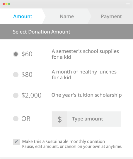
We structured the donation process into three clear steps, ensuring minimal cognitive load and better user flow:
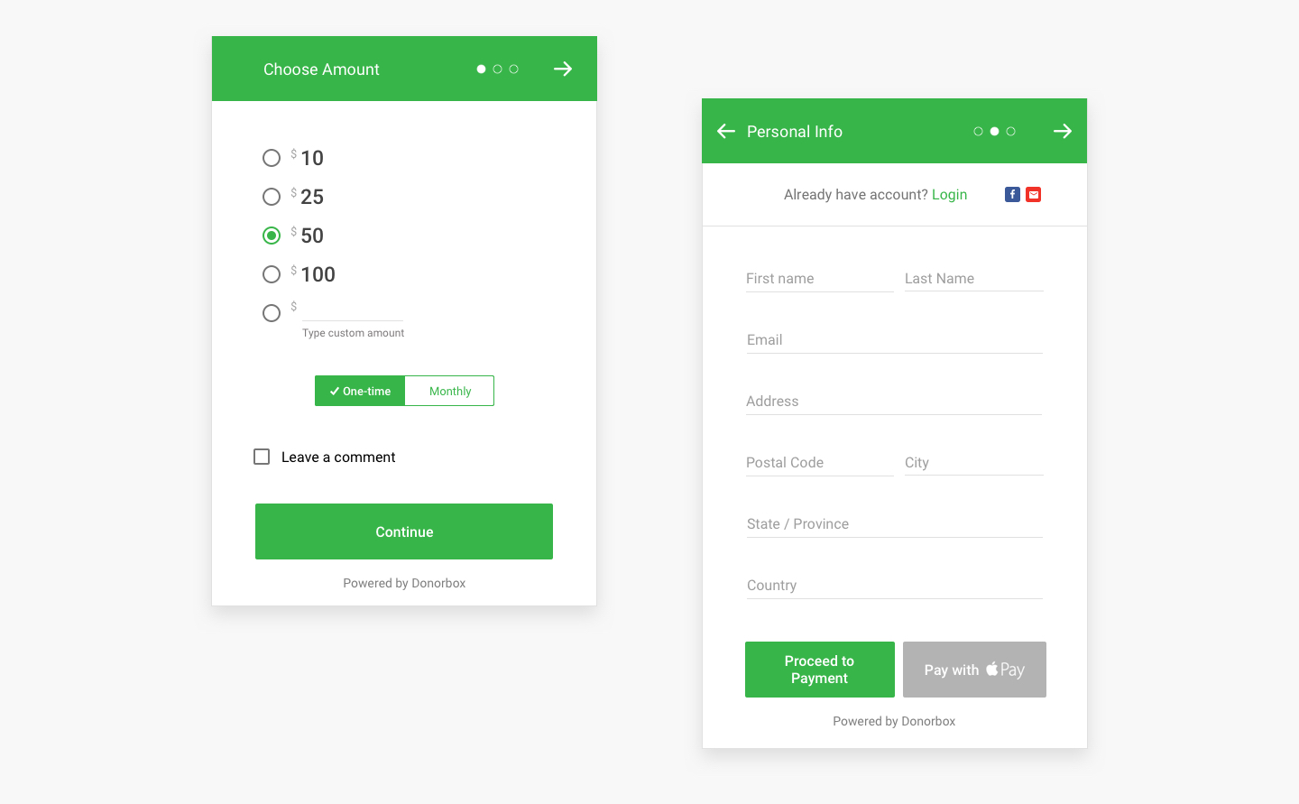
- Select Donation Amount: Users choose the desired amount, indicate whether it is one-time or recurring, and can add optional comments.
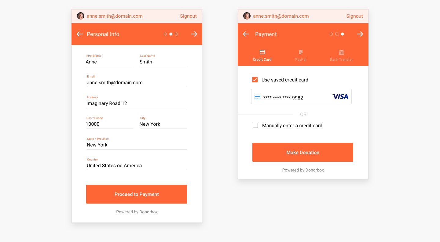
- Enter Personal Information: Users input legally required personal data such as name, email, and address, designed to be intuitive and easy to fill out.
- Provide Payment Information: Users select their payment method (credit card, PayPal, or bank transfer) and finalize their donation.
This streamlined IA made complex tasks more manageable, enhancing usability and providing a clearer path to completion.
Interaction Design:
I considered various user flows to ensure a smooth experience:
- The form could be customized with any branding color, helping non-profits integrate it into their website without disrupting the user experience.
- While maintaining a focus on donation law compliance, supporting extensive personal data input while keeping the user focused on the primary goal—completing the donation.
- Micro-interactions, such as real-time form validation, visual feedback for each step, and hover states, were implemented to reduce user errors and keep users engaged throughout the process.
Wireframes & Prototypes:
- Created wireframes that addressed key pain points and simplified the user journey.
- Built interactive prototypes using Marvel prototype app (popular in 2016.), emphasizing clean, modern UI with a clear visual hierarchy. Prototypes were shared with the internal team and stakeholders for feedback.
3. UI Design & Collaboration
UI Design:
- I suggested Google Material frontend library as the foundation for the UI, as it offered a modern, fast-loading interface with a wide range of customization options.
- The form layout was optimized to ensure users could easily focus on key actions, avoiding visual clutter.
- The color palette and branding options were flexible, allowing non-profits to adapt the form to their specific brand while maintaining high usability.
Key UI Features Implemented:
- Progress Indicators: A progress bar was added to provide users with a sense of completion and success, addressing the lack of finality mentioned by users.
- Call-to-Action Optimization: Buttons were made visually prominent, and feedback elements like hover effects and visual emphasis were added to encourage interaction.
- Scalability: The form was designed to scale with different amounts of data, ensuring it could handle both simple and complex donation processes seamlessly.
Collaboration:
- Worked with the development team to ensure the design was feasible from a technical perspective.
- Coordinated with product manager and Donorbox founder to align the design with business objectives and ensure the solution met user needs without adding unnecessary complexity.
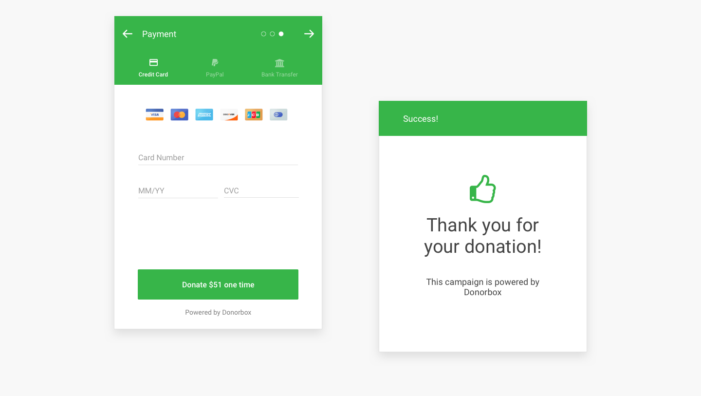
4. Iterating design
Iteration:
- Based on feedback, we made further adjustments to the donation flow and interaction design, including refinements to the progress indicators, button placements, and the layout of personal information fields.
- We tested various combinations of donation amounts, colors, and user flows to optimize conversion rates.
Outcome
Impact Metrics:
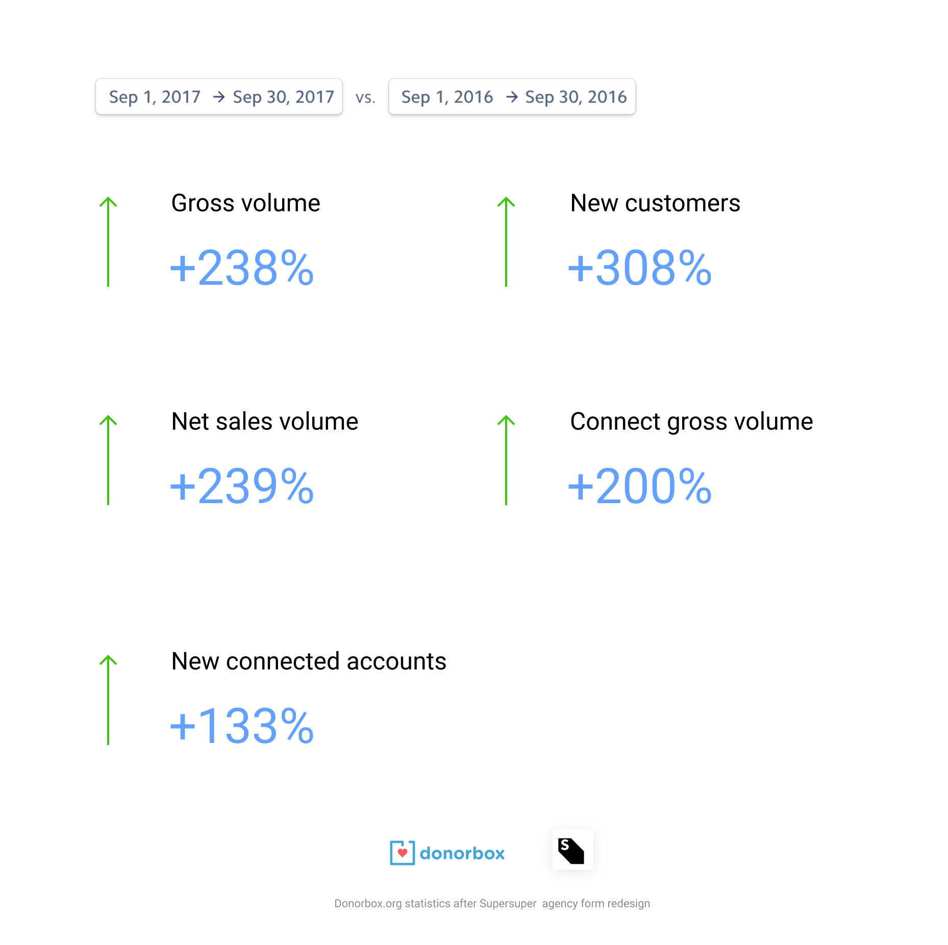
Key Takeaways and metrics up to 2018:
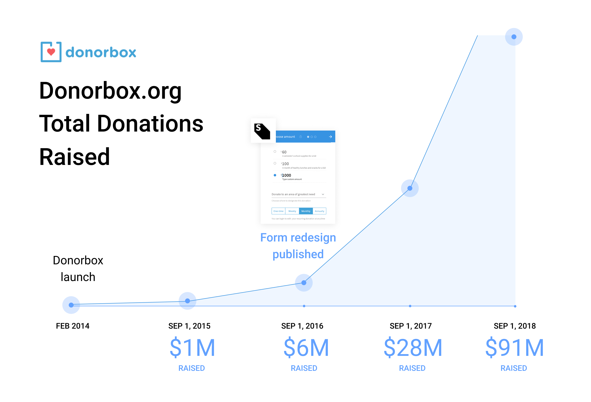
The redesigned donation form was a success, improving both user experience and conversion rates. By focusing on a simple, scalable design that could be easily customized by non-profits, we delivered a product that enhanced usability without sacrificing functionality. In total, by September 2018, the form processed $91 million USD!
Of course, the success of Donorbox cannot be attributed solely to design; the Donorbox team did an outstanding job with SEO, development, marketing, and other fields.
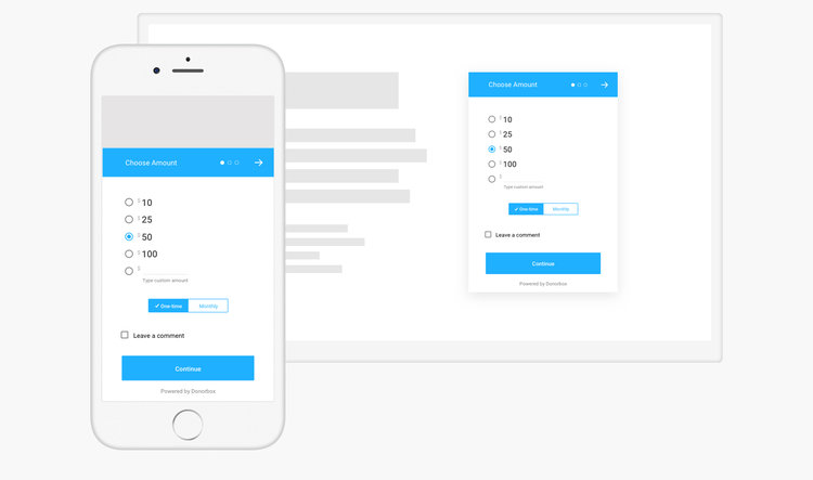
Donorbox Form on Mobile Devices and Embedded on Non-Profit Websites:

Please feel free to review the Donorbox donation form.
My contribution:
- project research
- Information architecture
- UX design
- visual design
- UI design
- Interaction design
- Interaction prototype design
- asset handoff