We will send a download link to your email address
Oops! Something went wrong while submitting the form
1. Intro
2. Role and importance of images in eCommerce shops
3. Adapting featured & gallery images to the user's needs
4. Image types used for eCommerce products
5. Using good product titles for great results
6. Building trust and social proof for users
7. Personalization is more important than ever before
8. Choosing and implementing user-friendly product description
9. Creating desire with storytelling
10. Designing visible CTAs buttons
11. Reviews and ratings for eCommerce stores
12. Where to position product description text
13. Saving user's time by setting the most commonly selected options as default
14. Engaging users with a suggestion list
15. Using images
16. Keep elements simple and properly grouped
17. Designing active states for personalization options
18. Designing dropdown menus
19. CTAs
20. "You may also like" suggestion element
Bonus: download Figma product page design template
If you’re thinking “What if I don’t have enough time" or "we do not have enough experience to deal with this”?. In that case, we offer free consultation on the best approach for your eCommerce. Just email us here
With an increasing number of eCommerce shops each year, it is harder and harder to attract and keep customers.
To keep business successful, the goal of every eCommerce shop is to increase sales rates, raise average order value to maintain lower shipping costs, create trust and gain loyal customers. To do so, we advise the following guidelines.
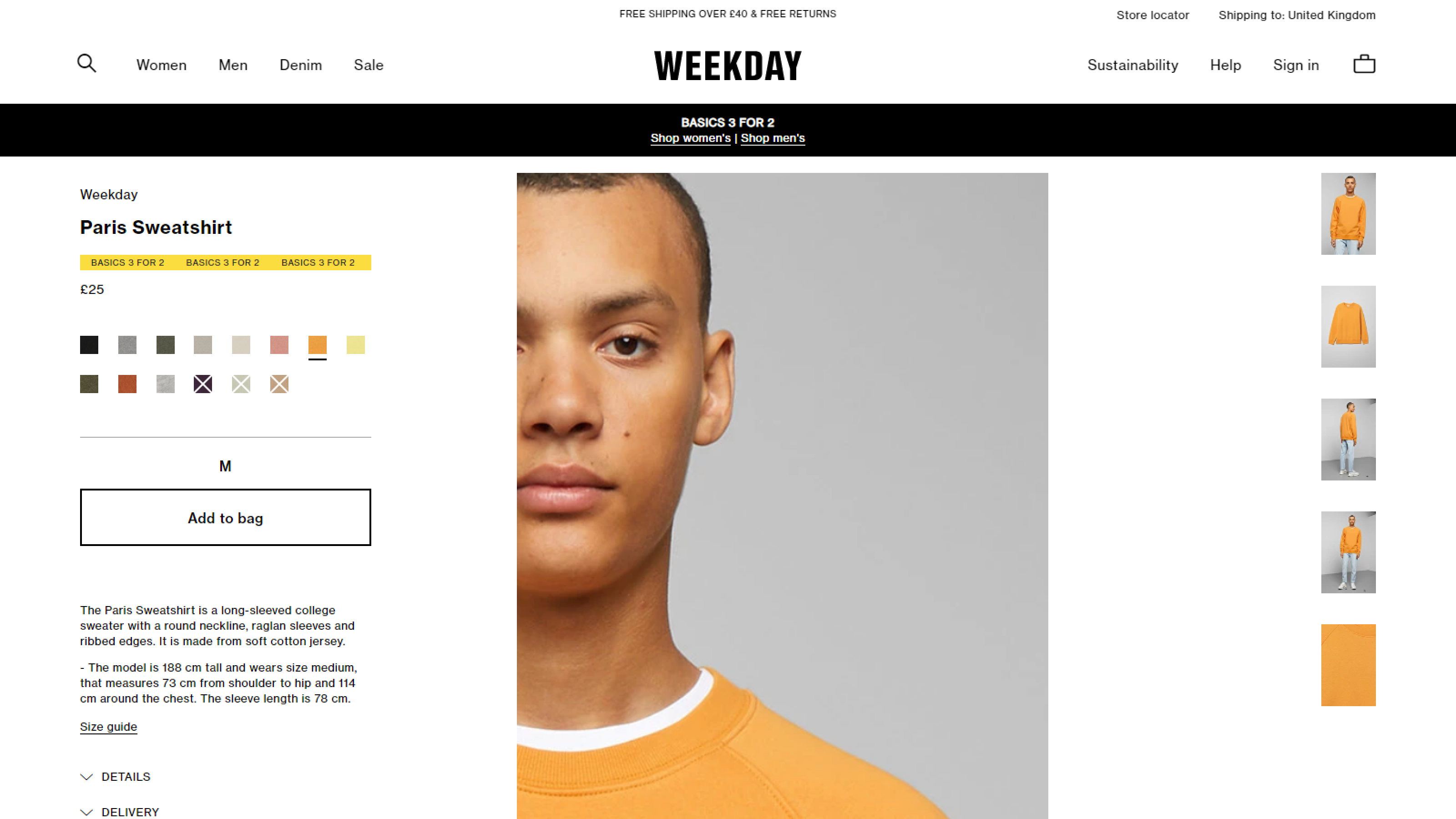
Images are an essential part of eCommerce shops. Users tend to make most decisions based on images first. Putting extra effort into the process of making images and paying attention to small details will have a significant positive outcome for a shop.
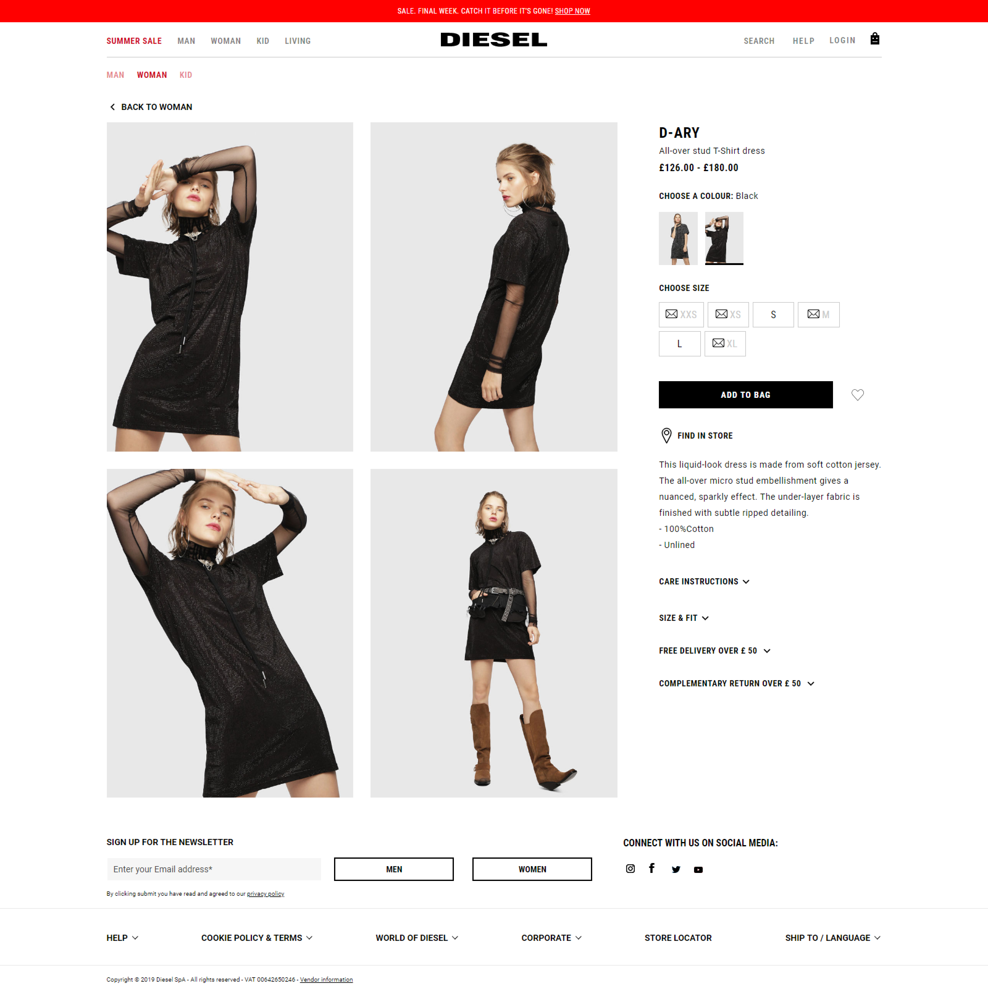
Therefore, images are the most important part of eCommerce shops, particularly for those whose primary field is fashion or lifestyle art industries as their conversion rates virtually depend on visual elements. With such a, for example, fashion product it is mandatory to include alternate and detailed images as the buyer needs to be sure of what product they're exactly buying.
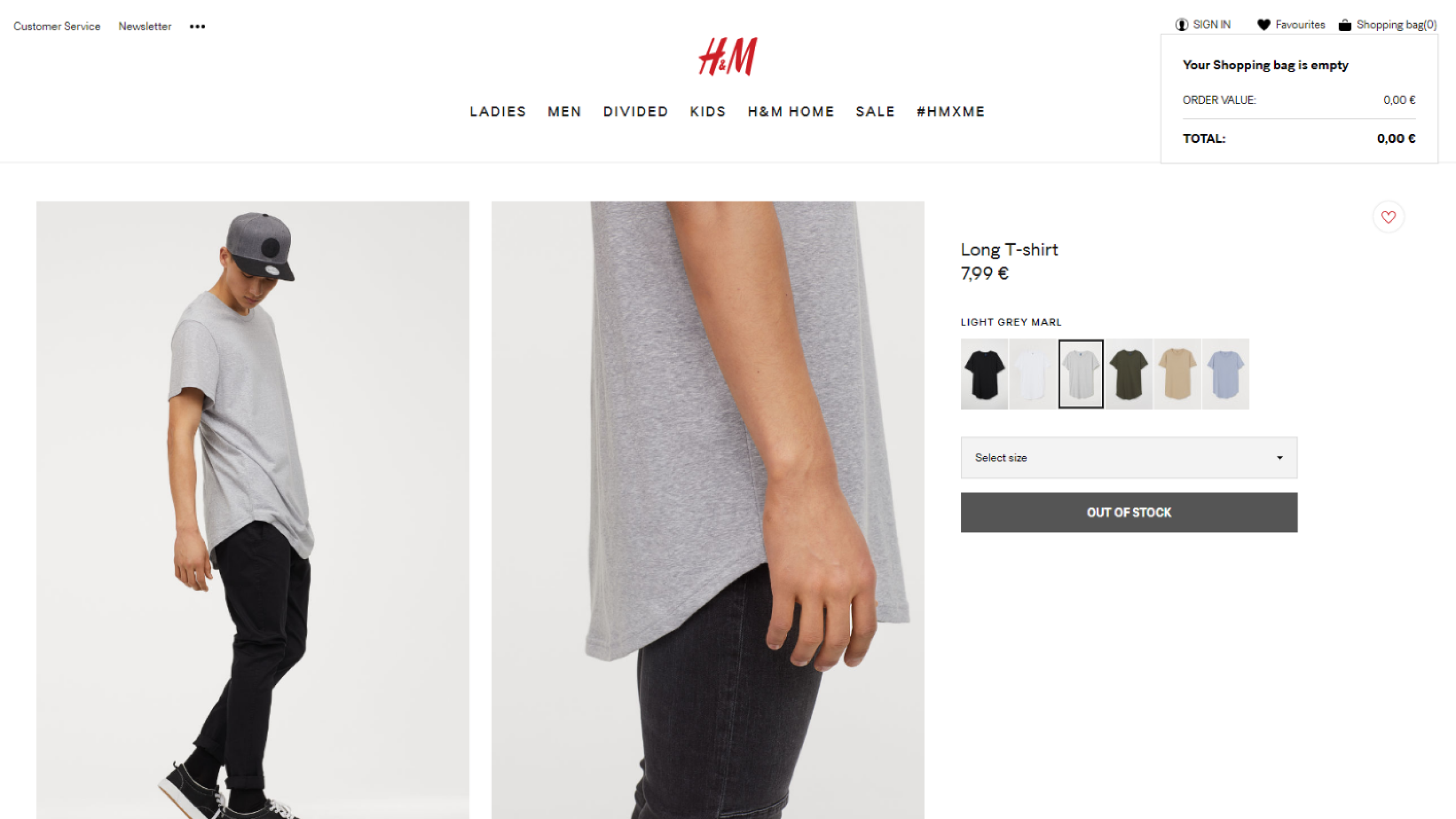
Choosing the right image for the product page can be challenging. There are a lot of elements of an image that should be looked out for.
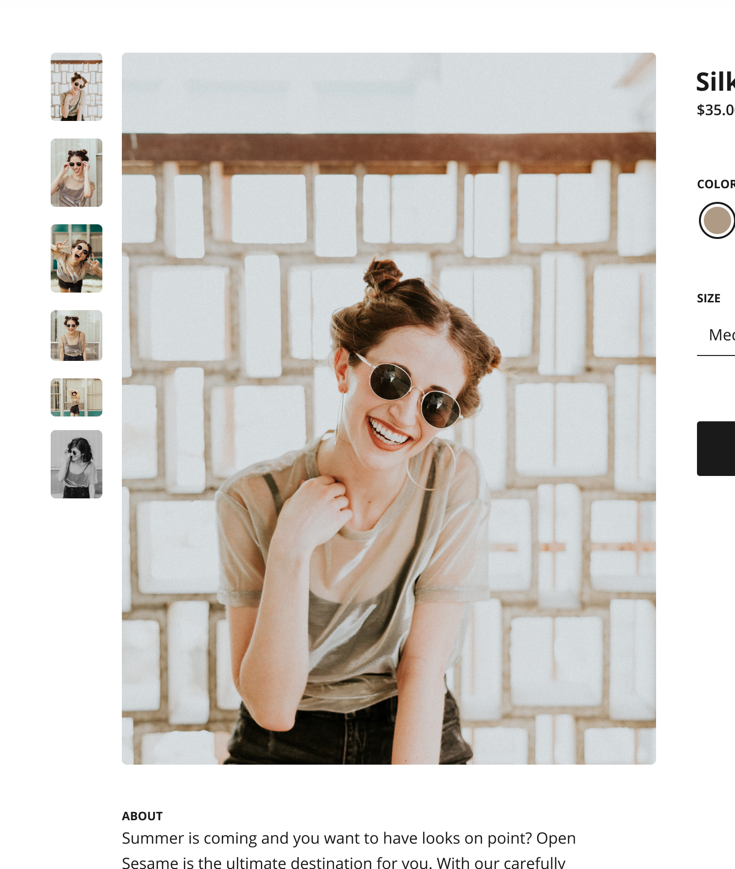
We advise that only one - featured image dominate the content of a page and act as a focus point. Do not make users squint trying to look for details, rather make an image large enough for them to see all the key details they are looking. In case you are faced with any technical limitations, embed an option such as click-to-zoom or similar solutions.
It is recommended to add at least a few additional images from different angles and to include lifestyle photos. They help users to better visualize products, and in some cases, develop an emotional reaction to a product.
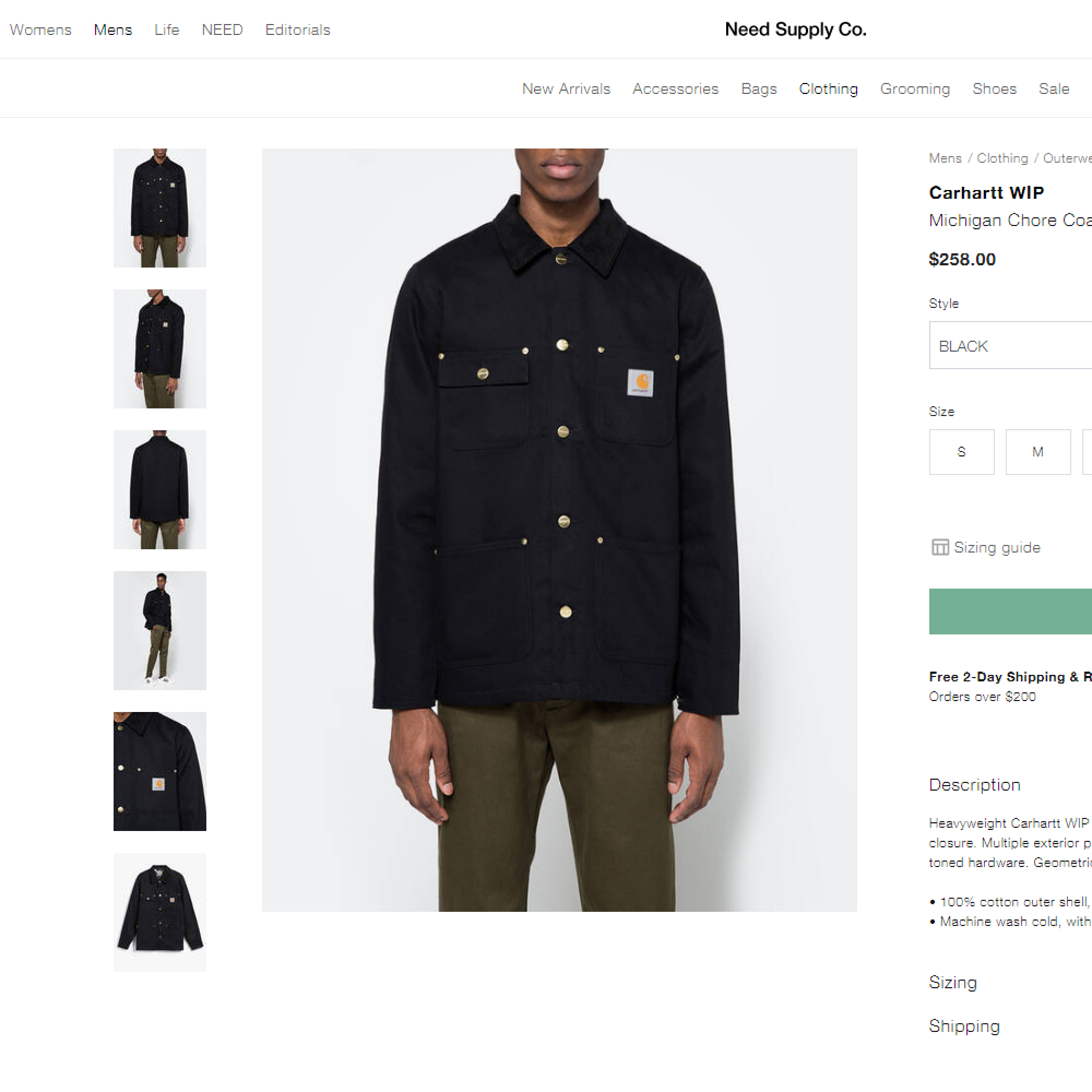
Optional bonus: Having a few images of certain details of your products can be a good thing. Users simply can't interact with products online as they would in an actual store. Many people like to feel and examine what they're buying. That is an experience they are deprived of while online shopping, and they hate it.
Additionally, if a product has a function, a video can be added to it showing how the product is used.
The usual mistake that should be avoided is uploading low-resolution images that prevent the user to have a detailed look at the product. That alone can trigger anxiety in users because they are not able to get crucial information from the most reliable source of information.
When it comes to image styles themselves, it is important to pay attention to detail and it is best to use professionally made photographs. Since users tend to decide on the trustworthiness of your shop, based on how professional-looking images are, mainly related to high resolution, the more trusting users become.
Professional catalog style images are the best choice since they are made in studios in a completely controlled environment with objects in front of a single-color background, most commonly white. The catalog images will create a uniform and consistent look throughout the whole shop. Because of consistent look users will not be overwhelmed and they will direct their focus on the product itself.
Catalog style images will also fit other eCommerce shops in case one eCommerce shop decides to expand through other retailers.
Another advantage of catalog style images is that they tone down the visual complexity of the screen, which plays an essential role when it comes to information-heavy products.
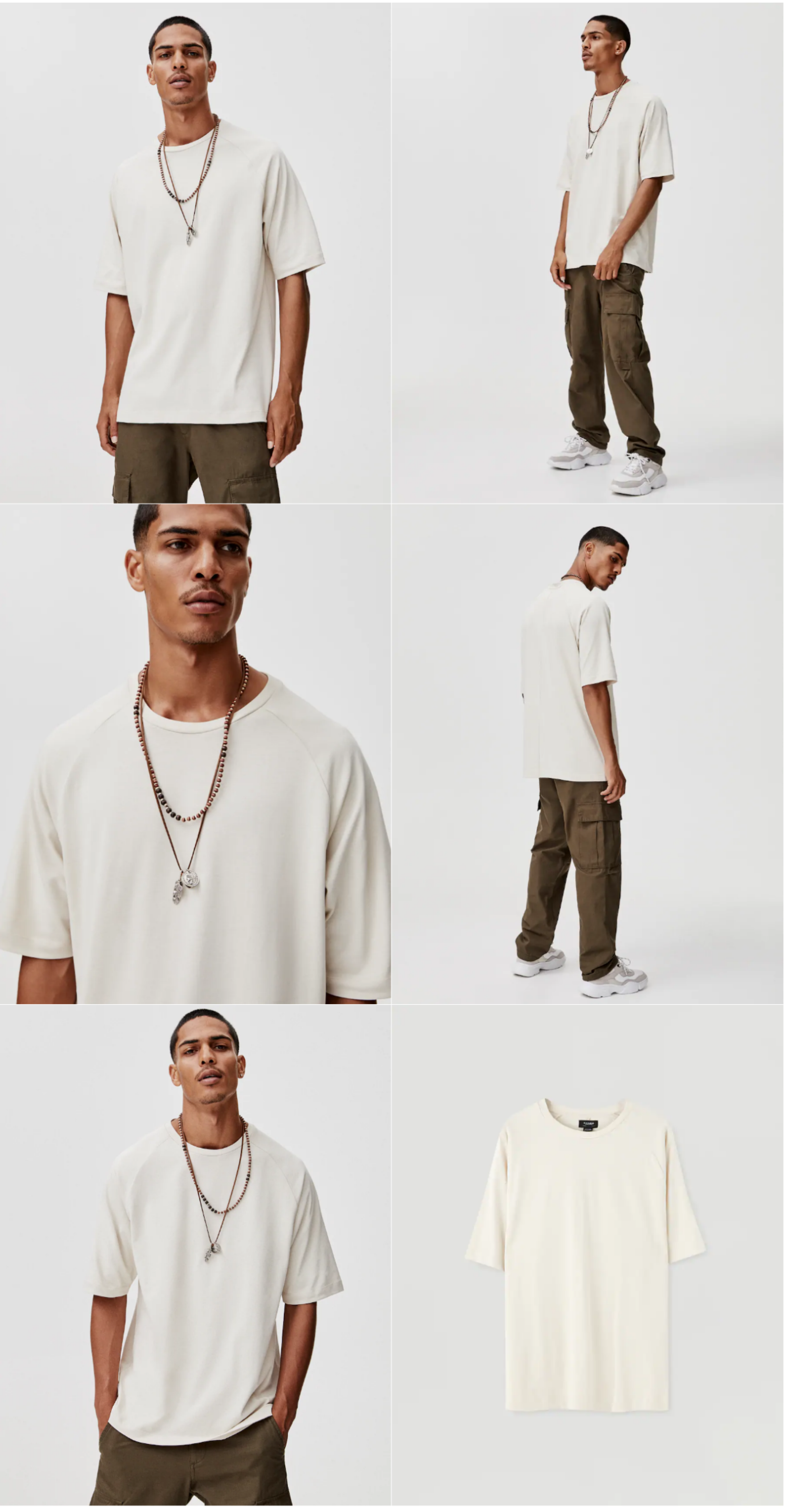
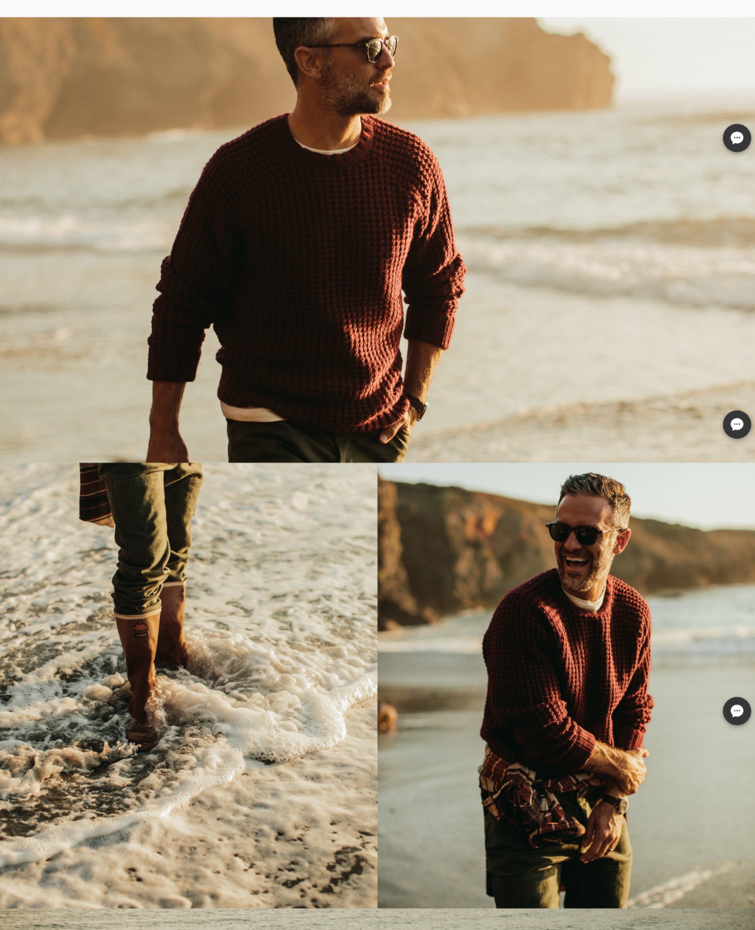
Lifestyle images can be made anywhere. Their main goal is to evoke emotions in the viewer and have the viewer resonate with the product. Locations, models, sets and everything else can be creative and adapted to users as long as the quality of images remains up to a standard.
Lifestyle images are also able to provide real context for users and give them an idea of what would that product look like in a real room.
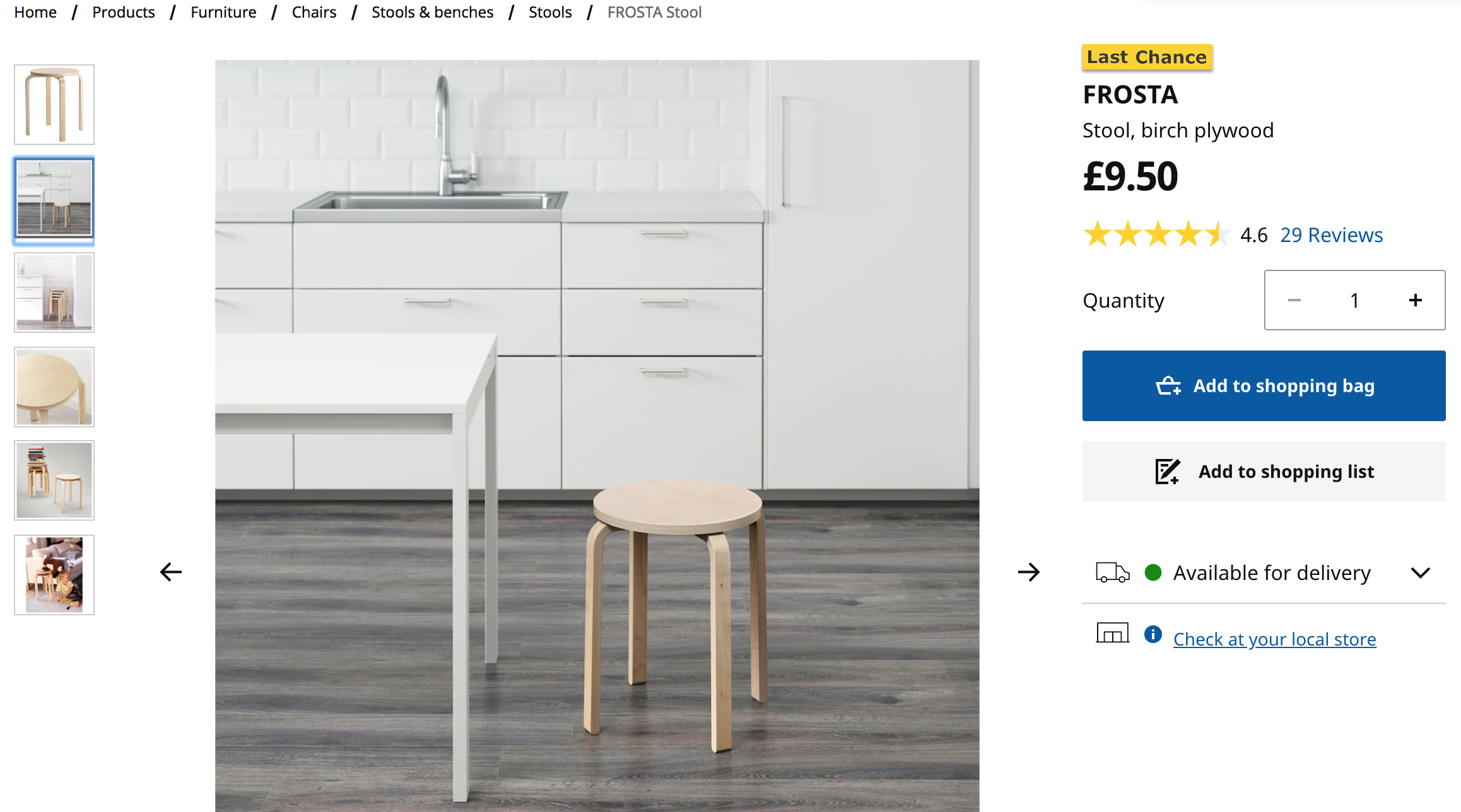
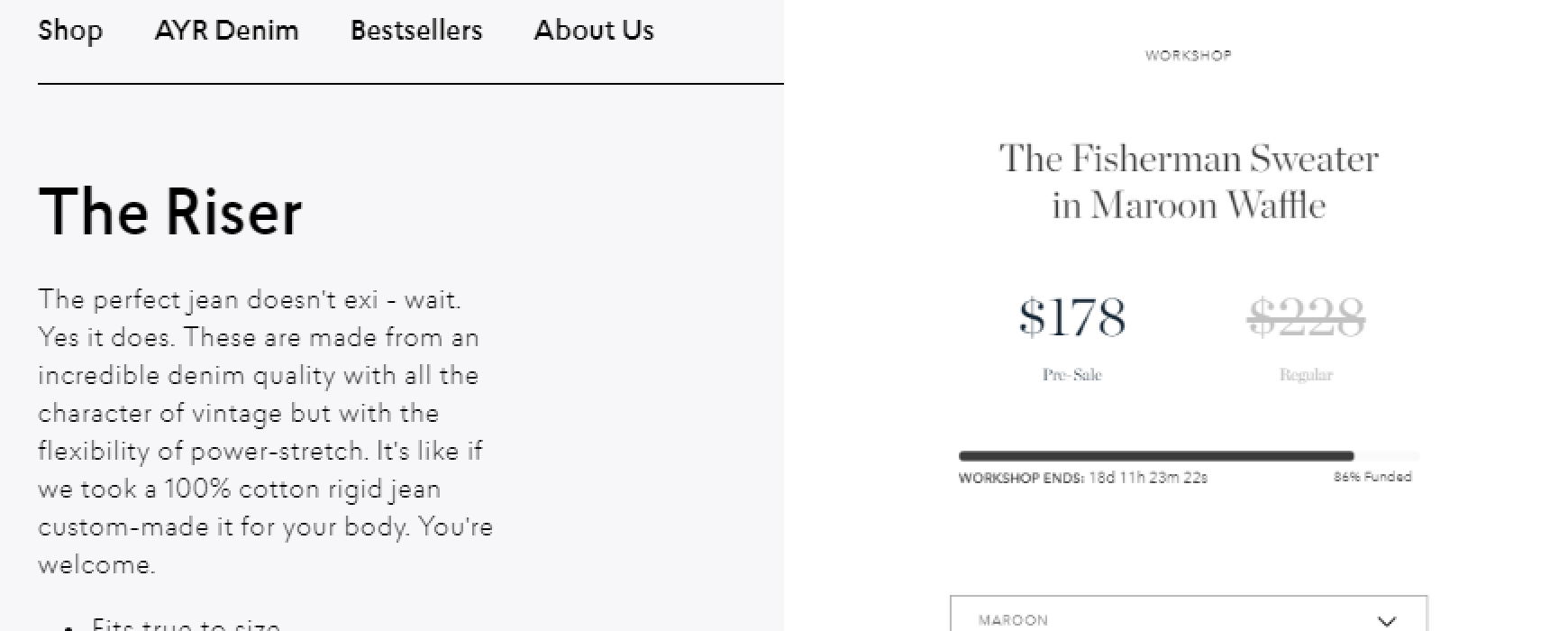
The first thing, apart from images, users look for and notice is the title. Giving products unique titles is always a good idea, but it is not always possible. Make sure to pay attention while naming products, because titles appear in search engines and titles can determine how close to the top results product pages will rank. Think about how users search for items, what would spark their interest and make them click, but steer clear from being too clickbaity. It can create distrust.
Note: Keep in mind that some users use primarily Google for navigating the web and looking for the desired product. Because of that, those users might have different user experiences from others.
If you’re thinking “What if I don’t have enough time" or "we do not have enough experience to deal with this”?. In that case, we offer free consultation on the best approach for your eCommerce. Just email us here
More important than the title is utilizing area around it since that is where the user's attention goes right after. That is a good place and opportunity to build trust with your users through reviews or your guarantee policies that will ensure product purchase and delivery satisfaction. The more expensive the product, the more research the user will conduct before buying to make sure their decision is satisfying.
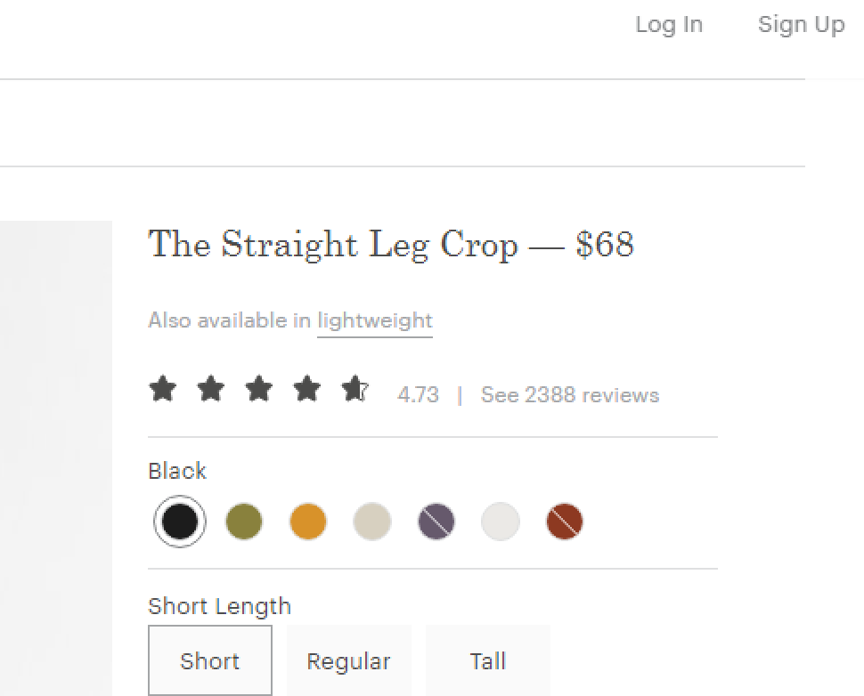
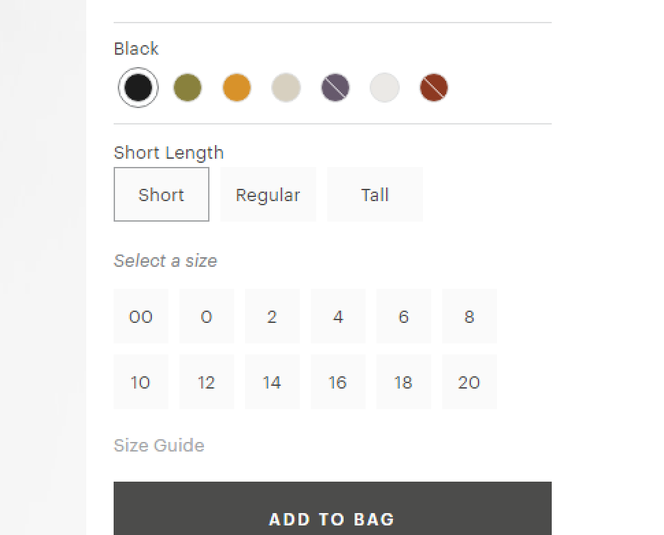
After users establish some trust, they usually look for personalization options, which are most popular with Millenials and, on the rise, with gen Z. Making a clear and easy way for users to utilize personalization options is more important than ever before.
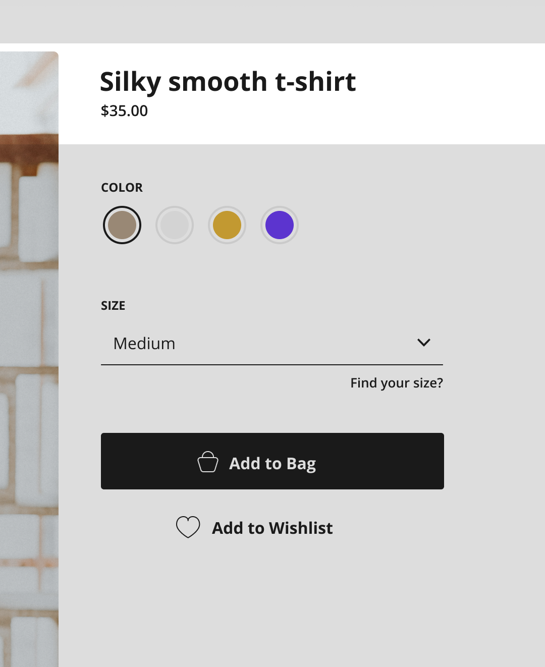
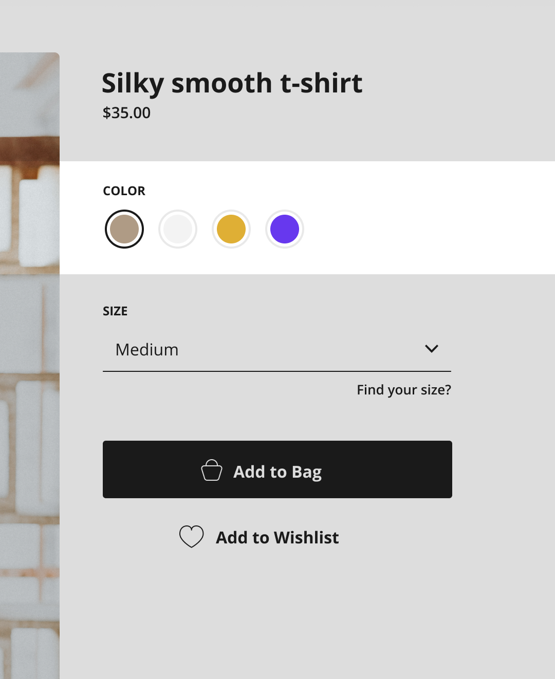
Allowing users to choose from a broader range of product options, such as size, color, and style, is key to growing and becoming a new leader in the industry. When possible, adding options for creating a unique product, e.g. adding custom text to a T-shirt, can bring more traffic to the shop.
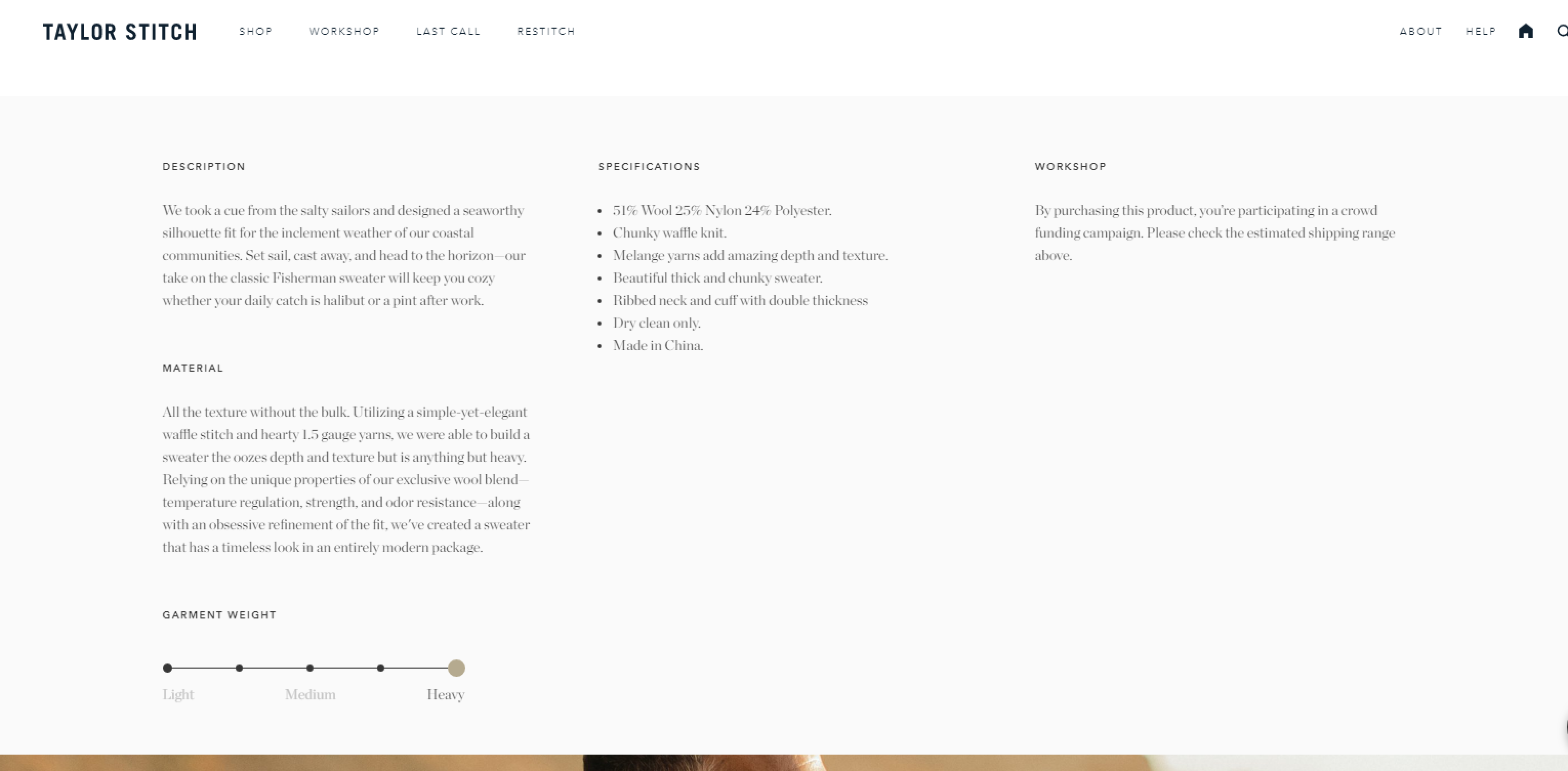
The amount of information accompanying a product tends to vary, naturally. The first thing to decide is whether products are on the information-heavy side, or if they are visually heavy. Some simple examples are fashion eCommerce sites, where users get the most information from images and some details from the description. Another example is an open marketplace platform for eCommerce such as Amazon, which has a variety of products available where in some instances user's priorities are detailed information rather than images.
It is important to have in mind that a product description has to answer all questions users might have while looking at the product page. An easy way to do that is to think about what frequent questions would pop up regarding this product and answer them clearly and concisely, which would ensure the content is user-friendly.
We advise that you always talk to your end customers because you will get far better insight into what are they looking for in a product. For example, one portion of your customers are maybe interested in knowing the exact materials and colors you used for a clothing item. If they have a hard to to find all details the conversion rates will drop.
We have plenty of experience in conducting similar user research so you can always contact us for any advice.
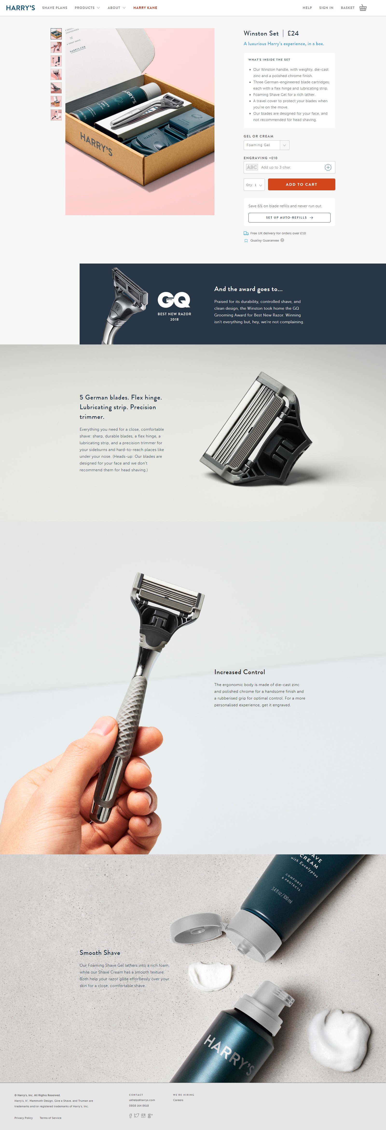
When storytelling is done well, it enables users to imagine in what way a product could help them and users will focus on possible results, rather than features.
Complement storytelling with additional lifestyle images that represent the product or stance of the brand when it comes to a certain topic. That way it is possible to create a community of people, who have the same stance, around your products and give them value beyond material goods.
Combining images and text in storytelling can be a challenging task. Pay attention to the size of paragraphs and the amount of text to avoid overwhelming viewers and losing their interest.
The most important button on the whole page is certainly Call-To-Action (CTA). For that reason, make sure it is easily visible, below personalization options, and use a clear copy on the button.
If storytelling is used for the product page, make sure there is an additional CTA at the very bottom of the page to make it easy for users to proceed to the next step where they will have a clear overview of all options.

Creating good reviews and rating system is necessary. Reviews bring great value to users and they tend to rely upon them when making a purchase.
Creating a good review system seems easy, but there are a few challenges. For example, in some cases, users decide to review different parts of service. You could encounter one user writing a review about the product quality, while others might review the service of handling an order and customer support on the same page. All reviews are useful but sometimes they can create confusion for users.
The solution is to create a good review form where there are separate sections for each part of the product. That way users do not have to go through lengthy reviews if they are looking for specific information. Adding suggestions or questions in the process of writing review can help out a reviewer on what to focus on to make review helpful for others.
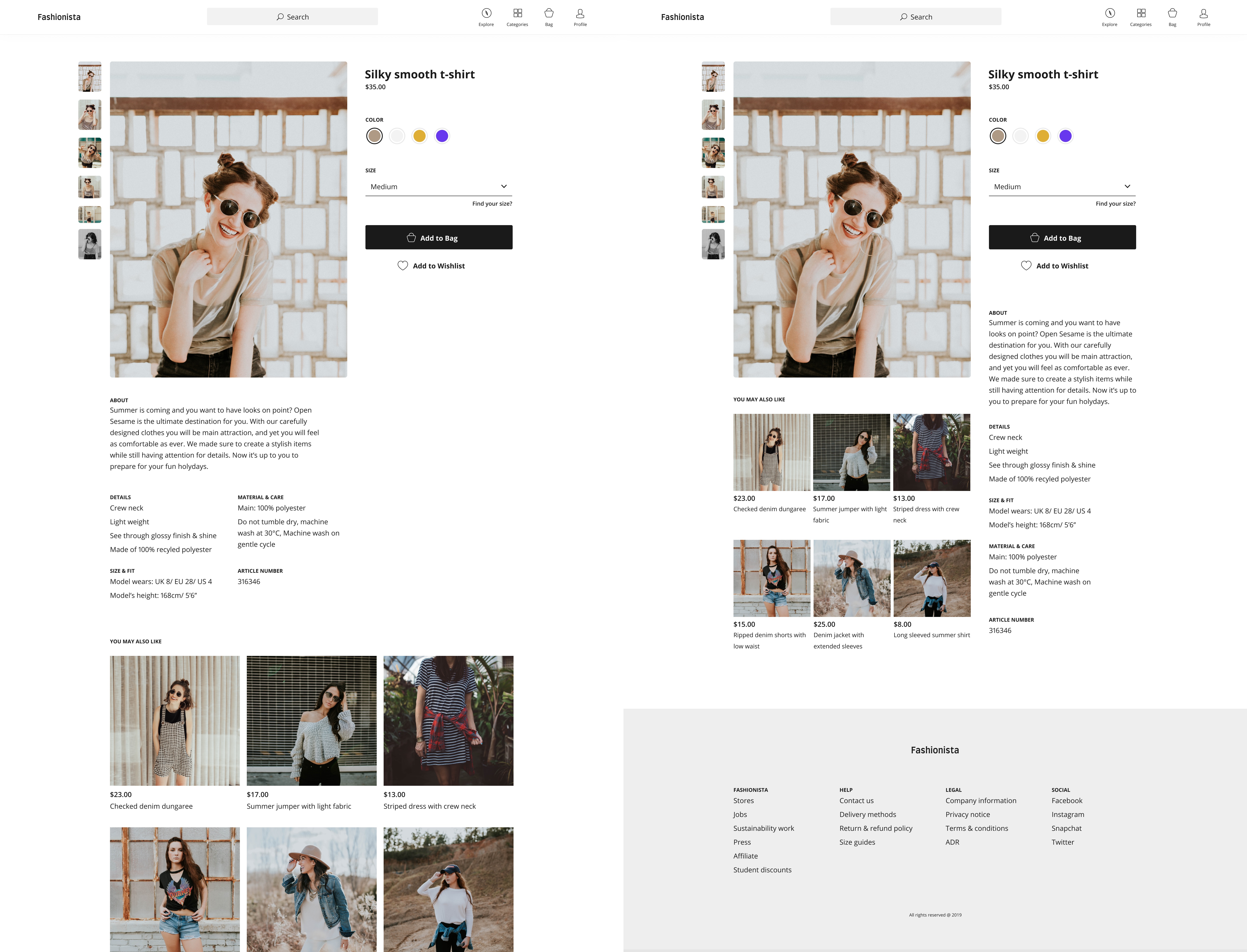
There are many different formats of eCommerce shops. Making the correct decision derives from paying attention to what formats and kinds of images will appear on product pages. If the size is uniform, then arranging other parts of the page will come more naturally. However, if the size of images varies, then positioning and sizing of the text field is dependent on those images. Otherwise, images could push important information further down the page and interrupt the flow.
One way of handling that is making the text field the same width as images, if it is placed underneath them, or placing text in the sidebar under the CTA button and thus keeping them separate. That way the consistency in design will be maintained and breaking the layout will be less likely.
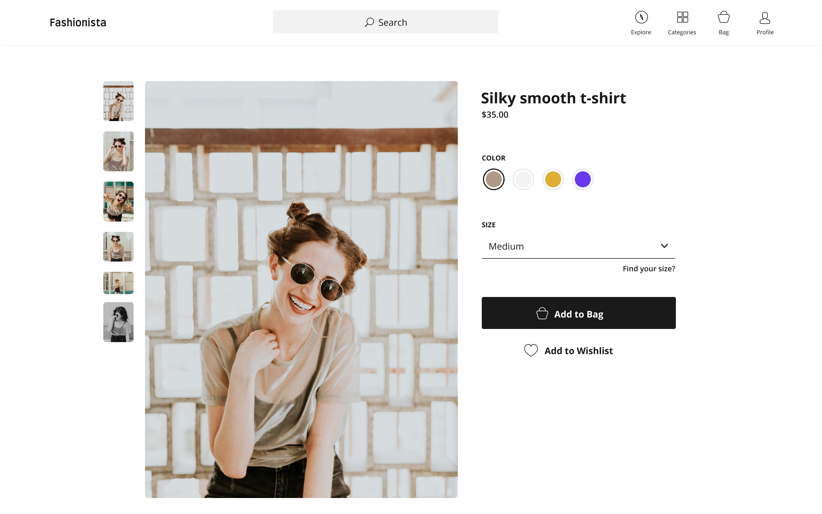
The personalization section is one of the hurdles which can make or break a conversion. The main goal of every website or app is to keep the required action steps from users at a minimum. It is also possible to have more steps which are split up and simplified in order not to overwhelm users.
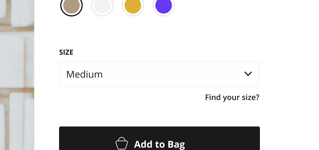
On product pages, there are a lot of interaction points - shifting through images, expanding sections (e.g. product details), carousels, FAQ sections, and personalization options. The main goal is to avoid unnecessary interactions from users. That is why it is suggested to place a default selection state as the most common option with users.
Sometimes assuming and preselecting an option, e.g. size, can have a negative outcome, therefore it is important to get to know the target audience and know if that is something they want or not.
With other personalization options, which do not have a direct impact on the user's viewpoint, it is acceptable to have a preselected option. If an eCommerce shop has many returns because of wrong orders, such as color, then making default statenoneand making users choose is the way to go and keep logistic costs down.
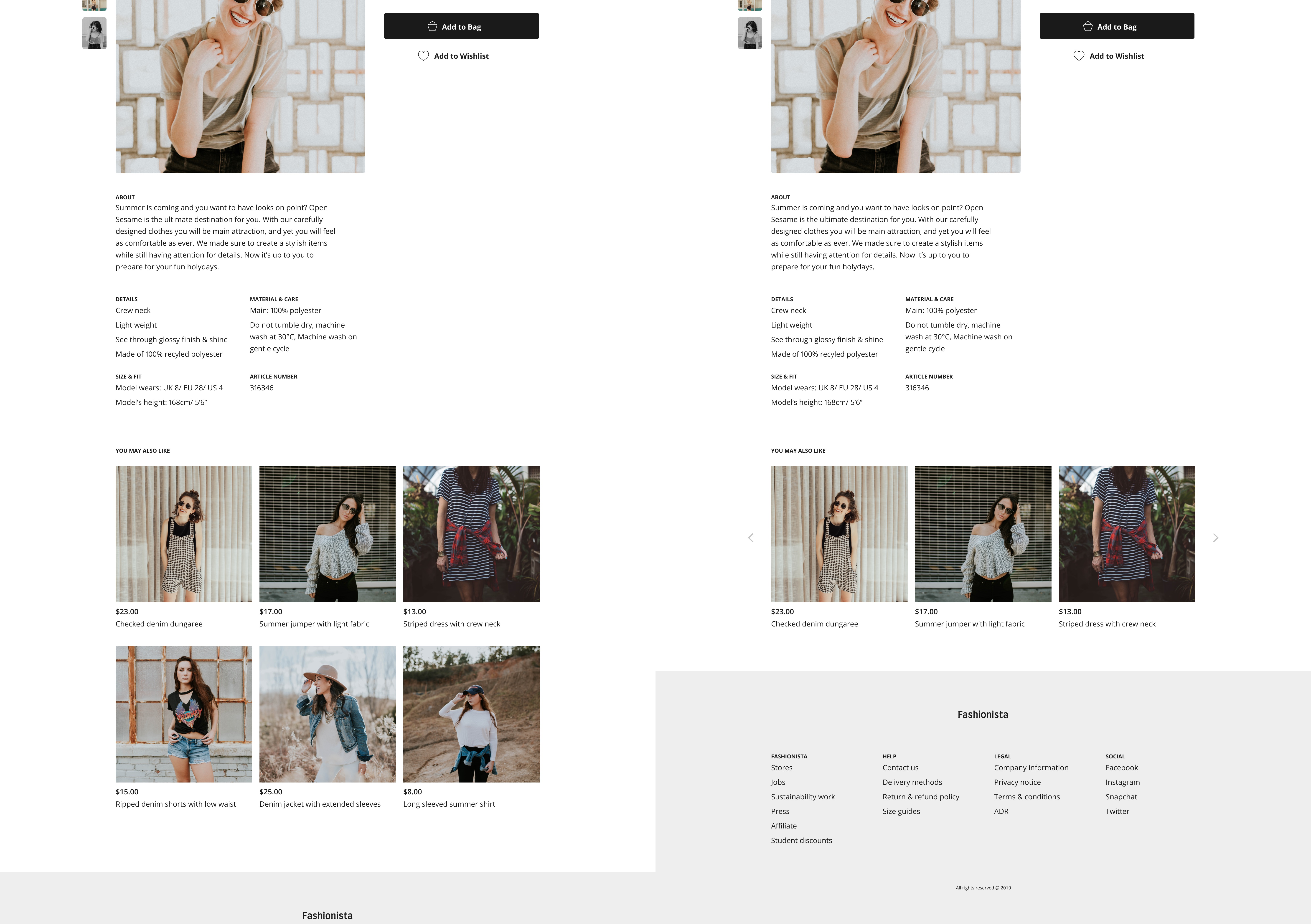
Suggestions are a good way to keep users engaged and create cross-sells, but it is often overlooked when designing. Three important things to keep in mind when designing suggestions are:
Many eCommerce shops put three to four images on the visible part of a carousel, and the rest of them available through arrow navigation. That might seem like a good solution, but it is not as effective as choosing fewer images but making them visible during browsing.
The more images users see, without having to navigate manually, the more likely they are to engage. Therefore:
If you’re thinking “What if I don’t have enough time" or "we do not have enough experience to deal with this”?. In that case, we offer free consultation on the best approach for your eCommerce. Just email us here

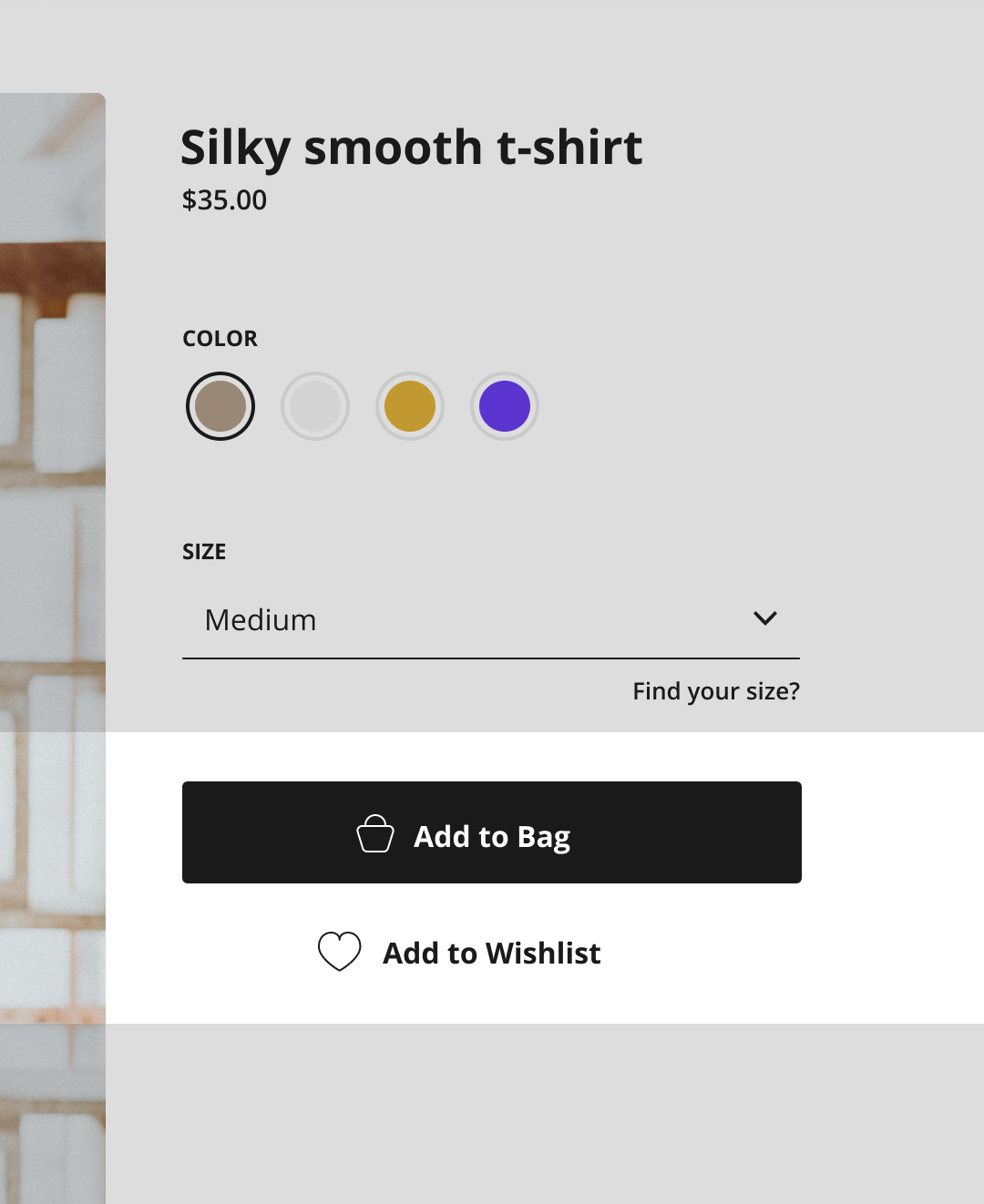

If you’re thinking “What if I don’t have enough time" or "we do not have enough experience to deal with this”?. In that case, we offer free consultation on the best approach for your eCommerce. Just email us here
Follow SuperSuper digital product design agency here to see valuable customer experience reports directly in your LinkedIn feed.
Creation of customer persona (if done properly) is a great step to understand your customer better, answer key questions, solve bottlenecks and improve the overall customer experience of your e-commerce. Stop making assumptions and start talking to your end customers to understand better what are their needs and how you can solve them.
See PostFinding a good eCommerce UX design agency in London can be difficult. There is a huge number of agencies but only some of them offer a true multi-discipline approach with concern about the overall product quality.
See PostBy reading this article you will get a sense in what areas are Shopify and Webflow eCommerce strongest. No eCommerce platform is perfect for every business case. You will find out which one might be a perfect fit for your upcoming eCommerce project or at least understand what areas are important in the long run.
See Post