Download Report Now
We will send a download link to your email address
Oops! Something went wrong while submitting the form

5 top pain points in the retail eCommerce customer journey
Plus a detailed guide on how to alleviate them and turn into an advantage
Free PDF Report DownloadSee More Details FirstCase study: Donorbox nonprofit donation form app conversion increase
Donorbox is a powerful fundraising software, a donation form that is super simple to set up and attracts more reoccurring donors. Donorbox helps nonprofit organizations fundraise with a fast, optimized donation payment system that can be launched in 15 mins.
Our challenge and goal of the design
The client wanted a scalable and adaptive web form that could fit into any website design. The challenge was to create a simple and clean looking donation box that can easily be branded according to the needs of the customer. It was intended to be simple to use, so simple that it does not show all the technological complexity that is behind it. The form also needed to works seamlessly on different platforms and in different languages. The online donation process, in general, is also subjected to government legislation that every donor must enter his full info.
The goal of the design was, of course, to improve the conversion rate of the donation form and achieve higher donation rates.
Our approach to design
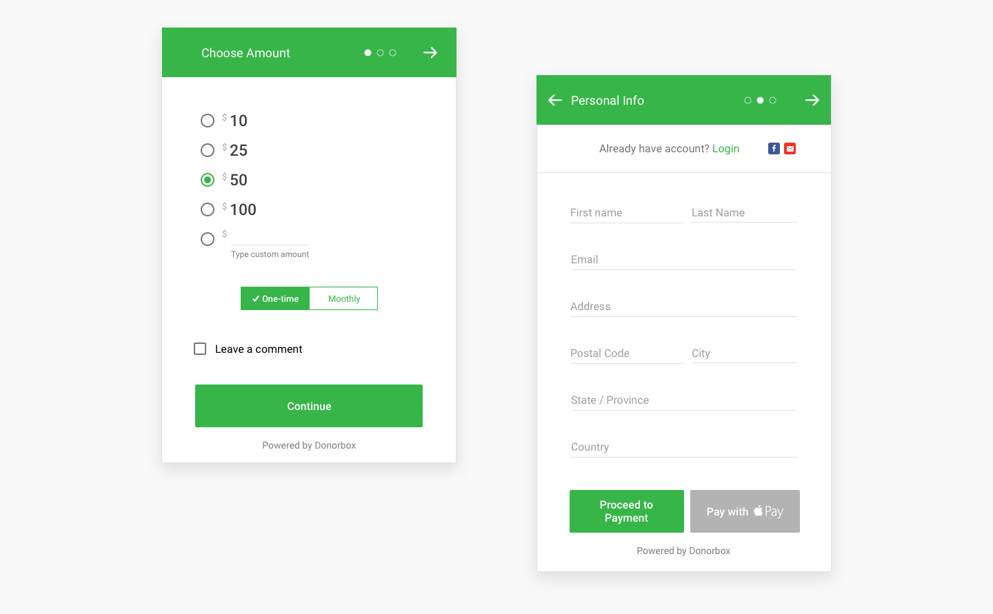
Visualizing the amount of donation was crucial as it was the first and perhaps the most important part of the donation process in the eyes of the user. The user had to be able to choose the amount easily and there was no room for any potential mistakes while selecting the amount. The donation was intended as a three-step process:
- selecting the desired amount of donation, selecting whether it is one-time or reoccurring and adding a comment
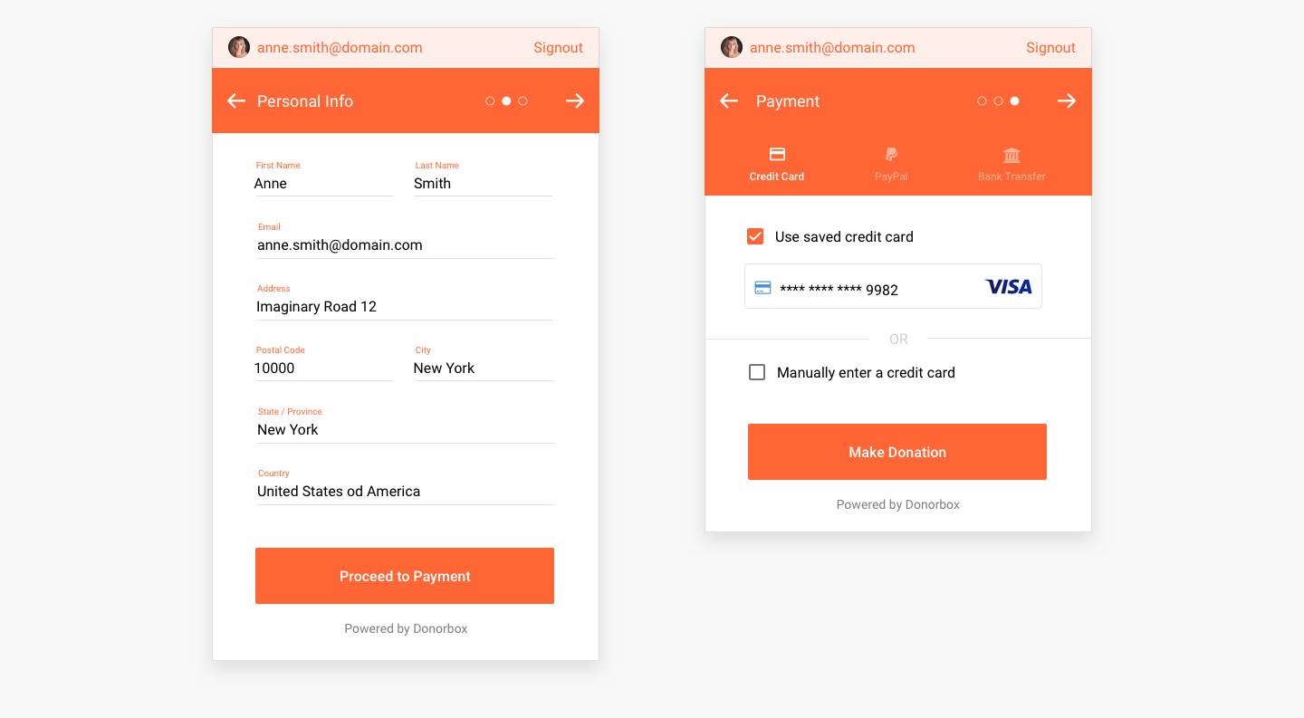
- adding personal information
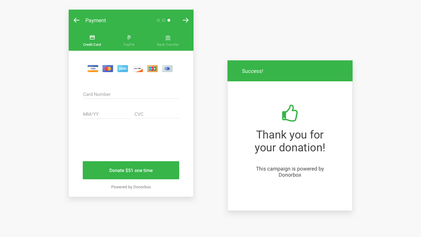
- adding payment information
Separating these input sections made the donation form clear and understandable for most of the users.
The result
Donorbox grew to be the leading donation form for nonprofits helping them maximize efforts and collecting more donations with the quick and painless checkout process. The design made it possible for Donorbox to be easily customizable and to blend to every website perfectly.
Please see how the redesign impacted the conversion rates below.
Show me the numbers, how the investment in UX pays off?
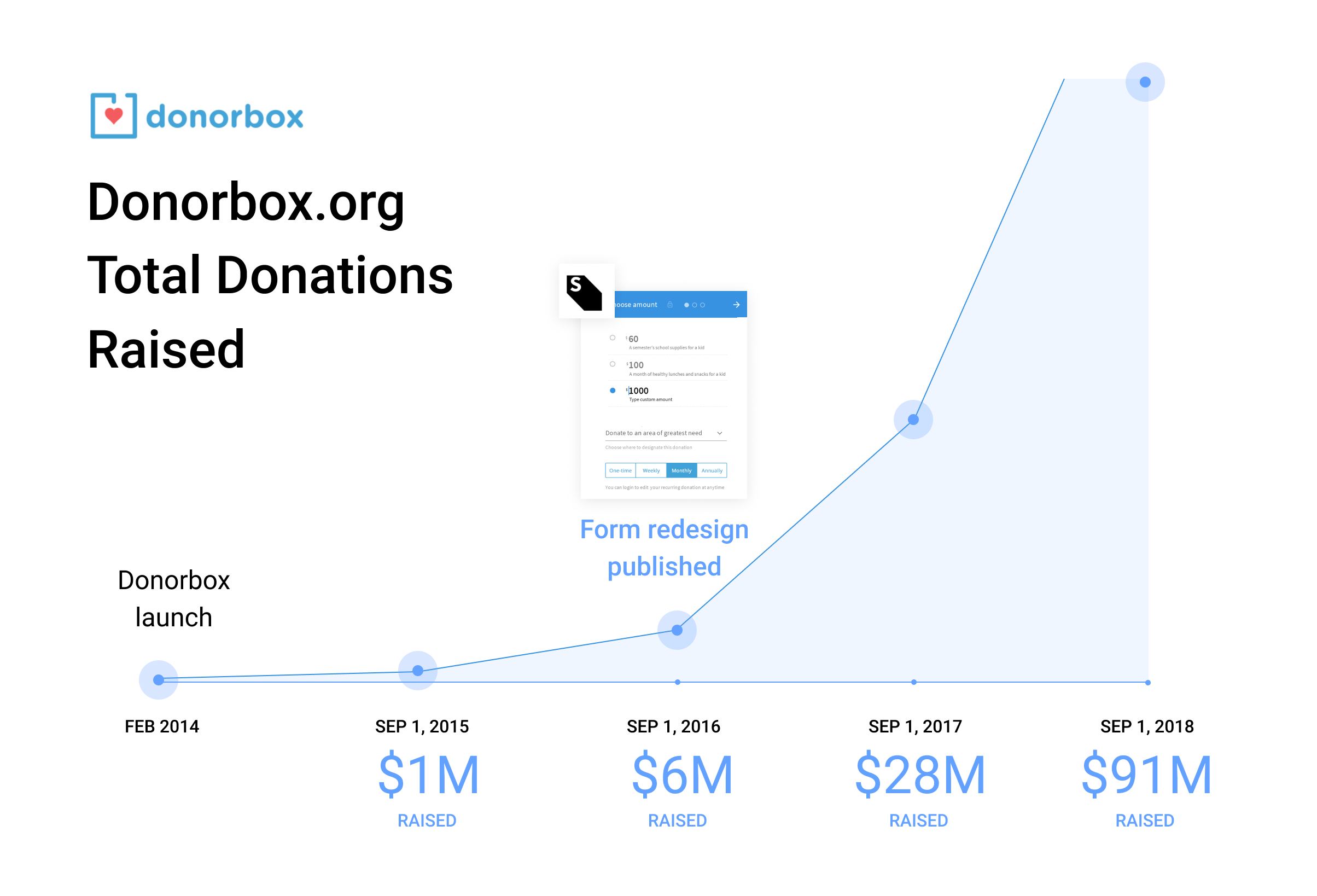
Donorbox increased the number of donations in the following year after the redesign and gain many new customers.
Take a look at the Donorbox impressive statistics comparison for September 2016. vs September 2017.
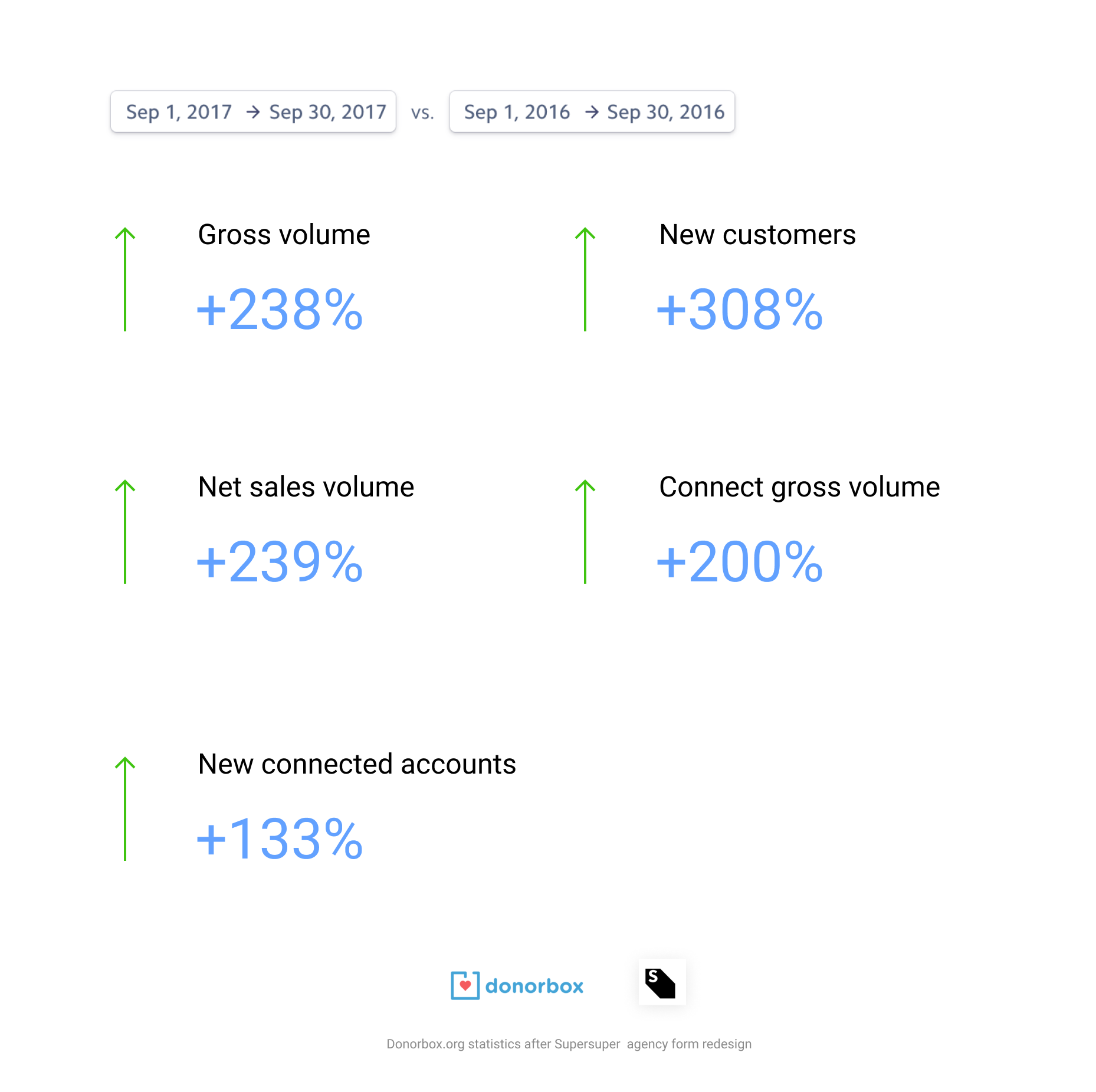
In total, in the months up to September 2018, the form processed $91 Milion!
Of course, the success of the Donorbox cannot be associated with design only, their team made an outstanding job in terms of SEO, development, marketing, and other fields.

Our point is that investment in UX pays off for sure, the average increase is 30% up to 300%.
In fact, recent research made by Forrester.com shows that improved UX/UI can enhance customer conversion rates by 400%.
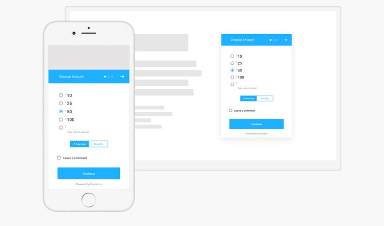
Please check all current Donorbox donation platform features.
If you want to know more
We also made a very interesting talk with Donorbox.org founder Charles Zhang. Take a look at the second part of the interview on how he achieved such outstanding results without seed investment funding! - Only bootstrapped.
And - if you want to check out a live version or start a donation campaign:
Check out Donorbox donation form here
